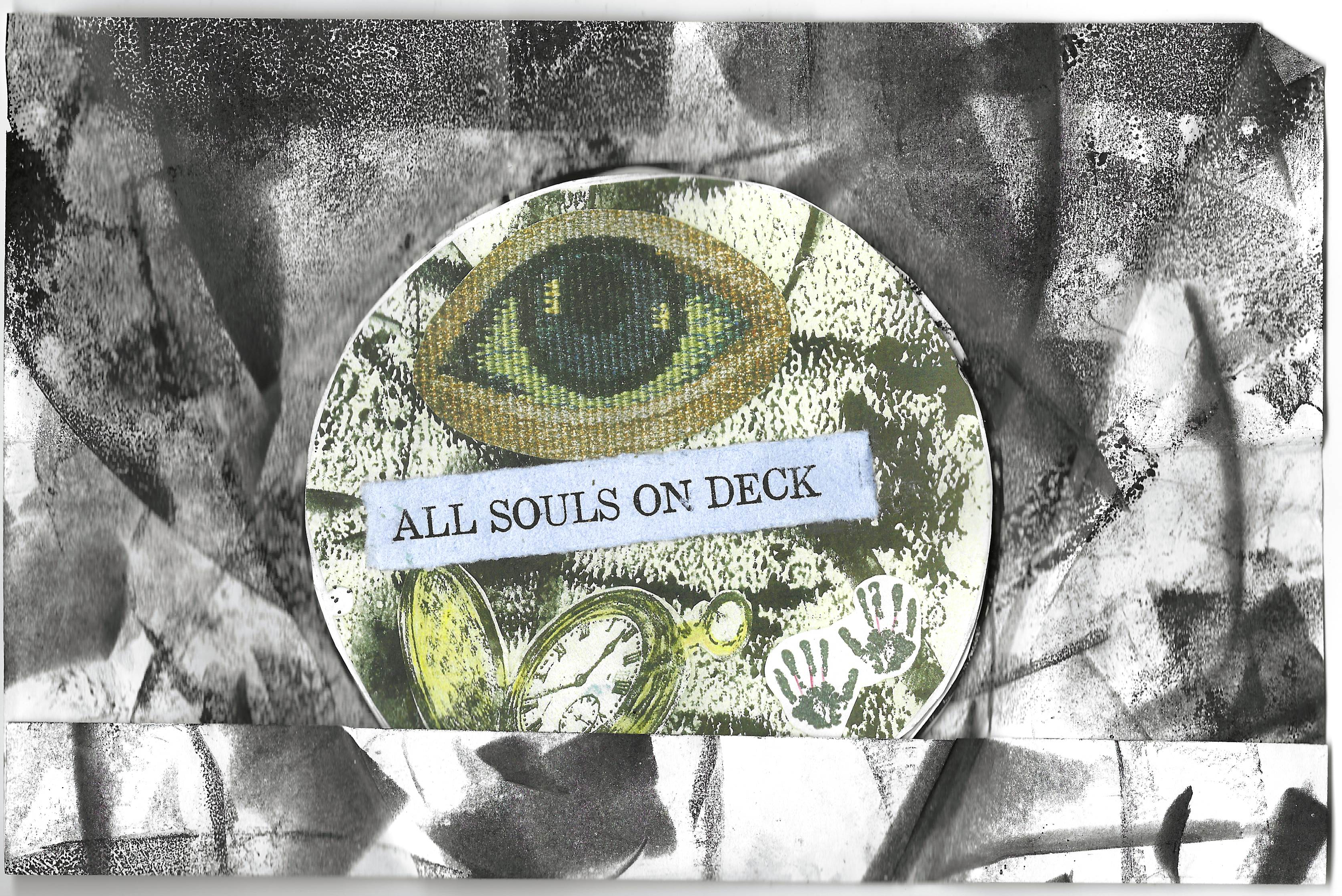
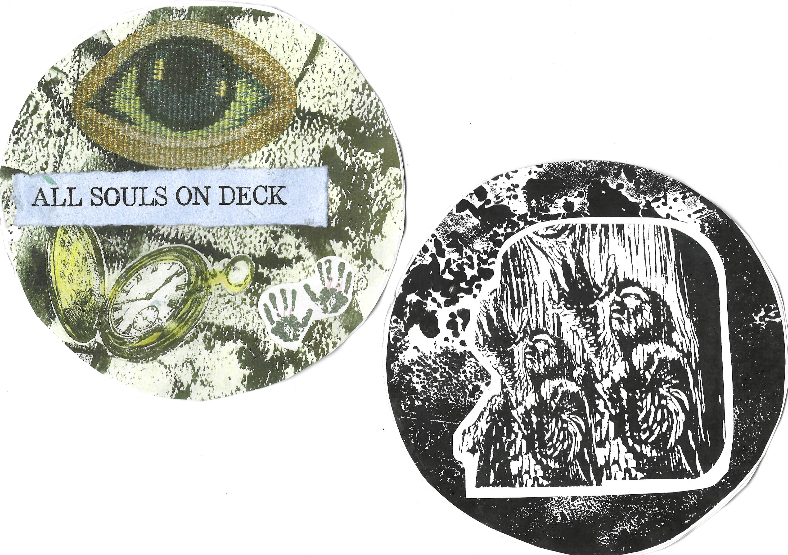
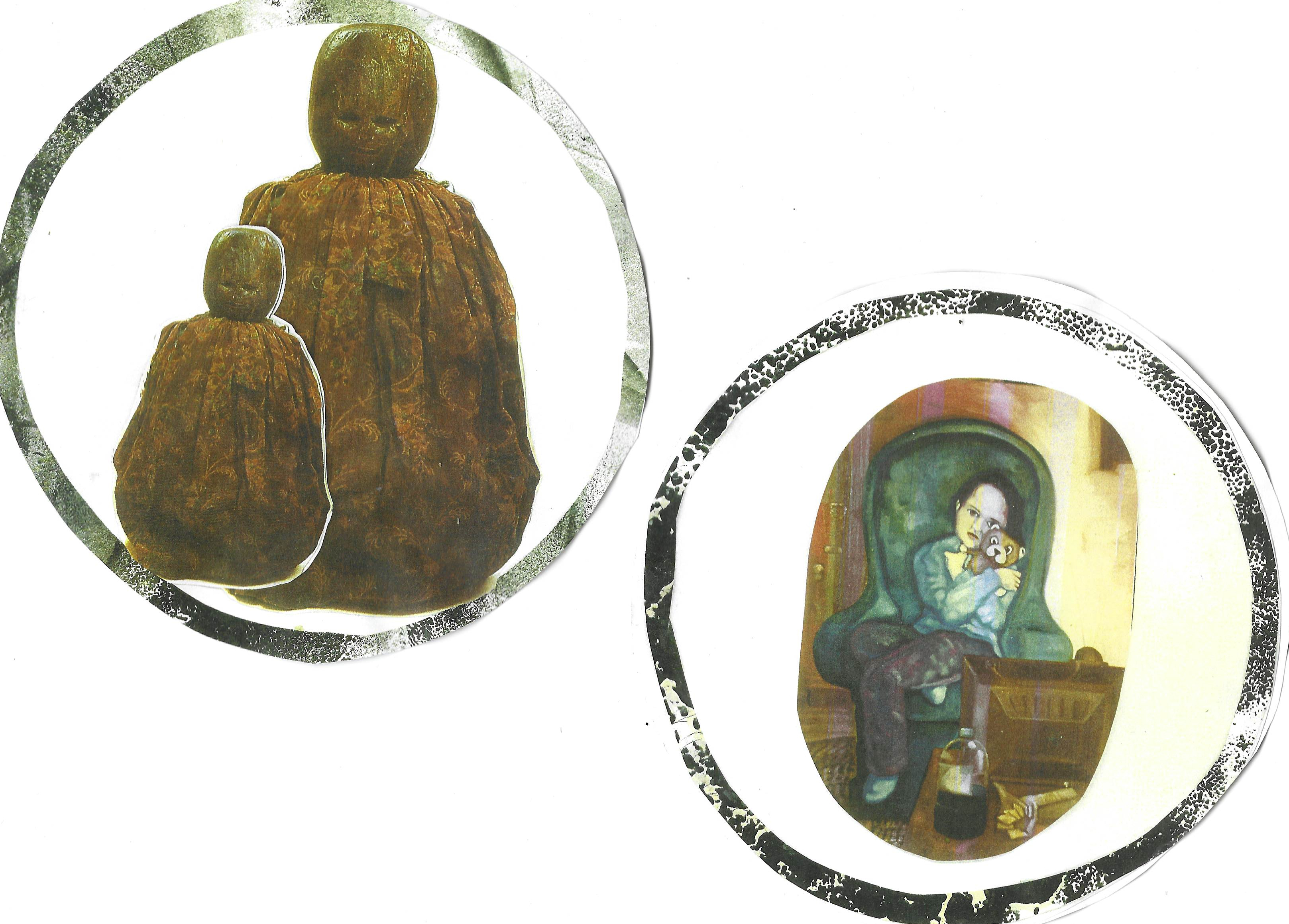
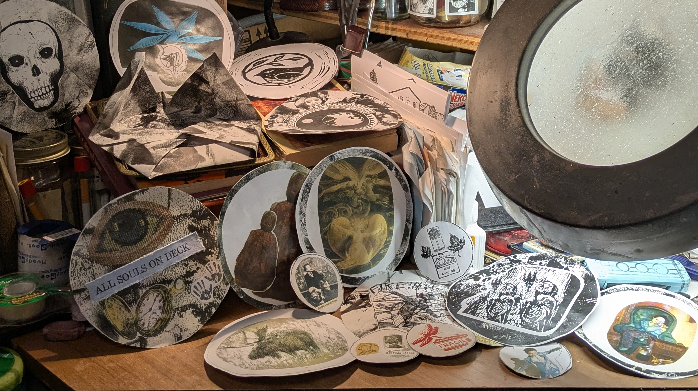
All Souls On Deck – Mail Art
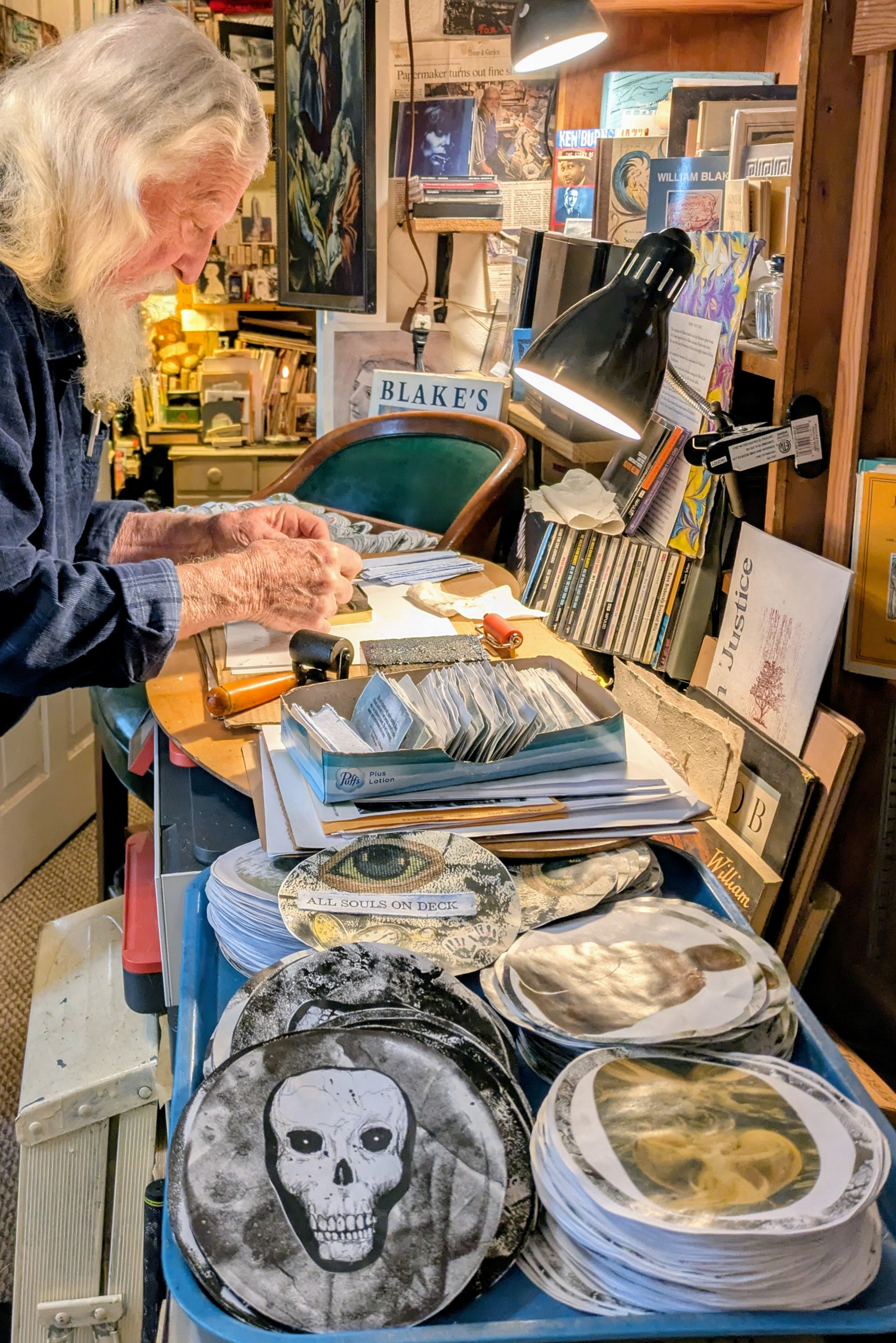
Here is JDJ letterpress printing a small title strip for the new project – but not in the letterpress shop -in my happy place, my library, which has been engulfed for weeks in a massive effort – 2600 cut-outs, 1400 gluings, and a whole lot of folding and wrangling to construct a set of round tarot-type art cards that are a care package for our times.
The set comes wrapped in a “decorative” origami envelope – this is the last big use of this black and white letterpress clean-up material for a long while – I promise!
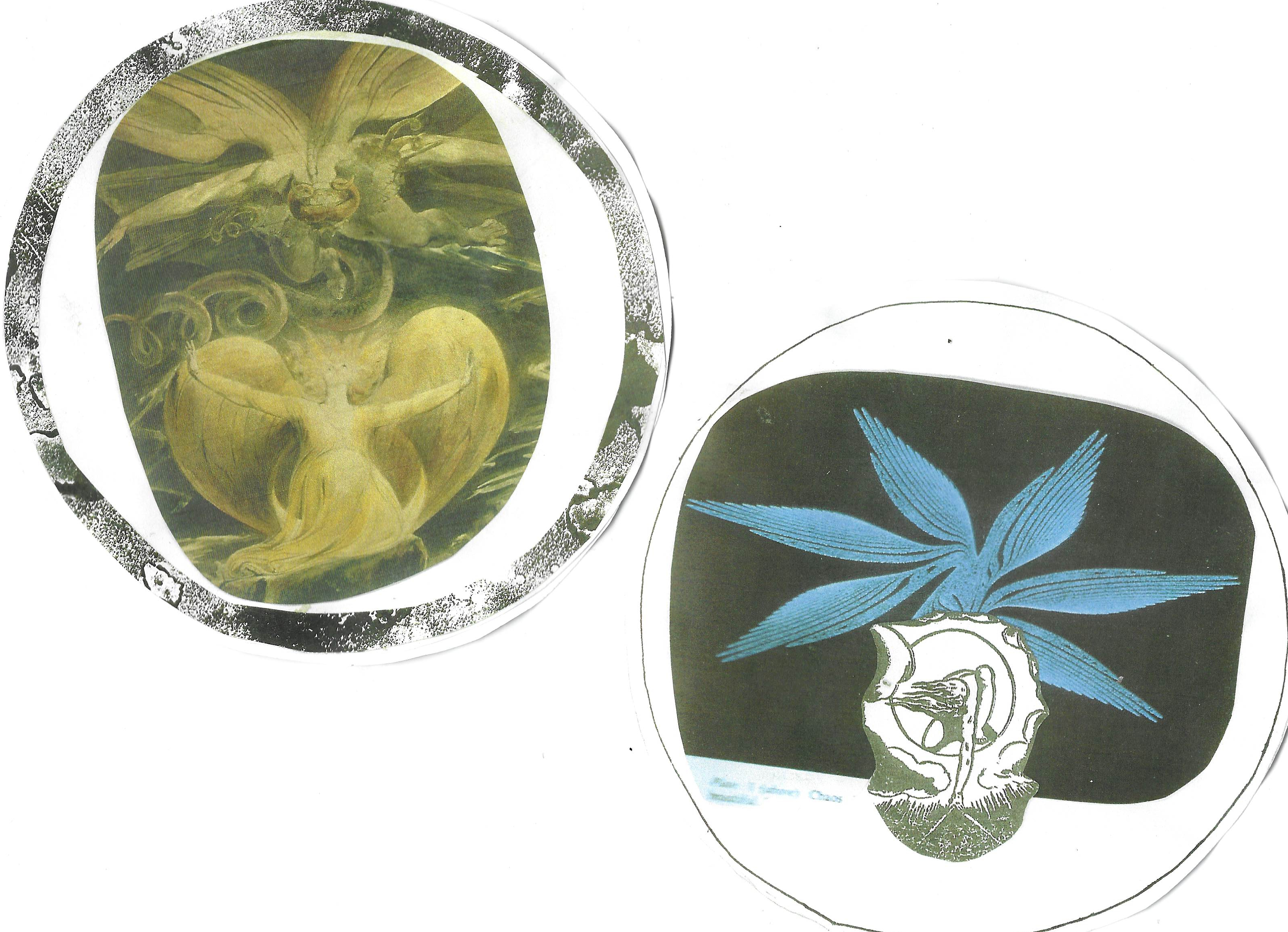
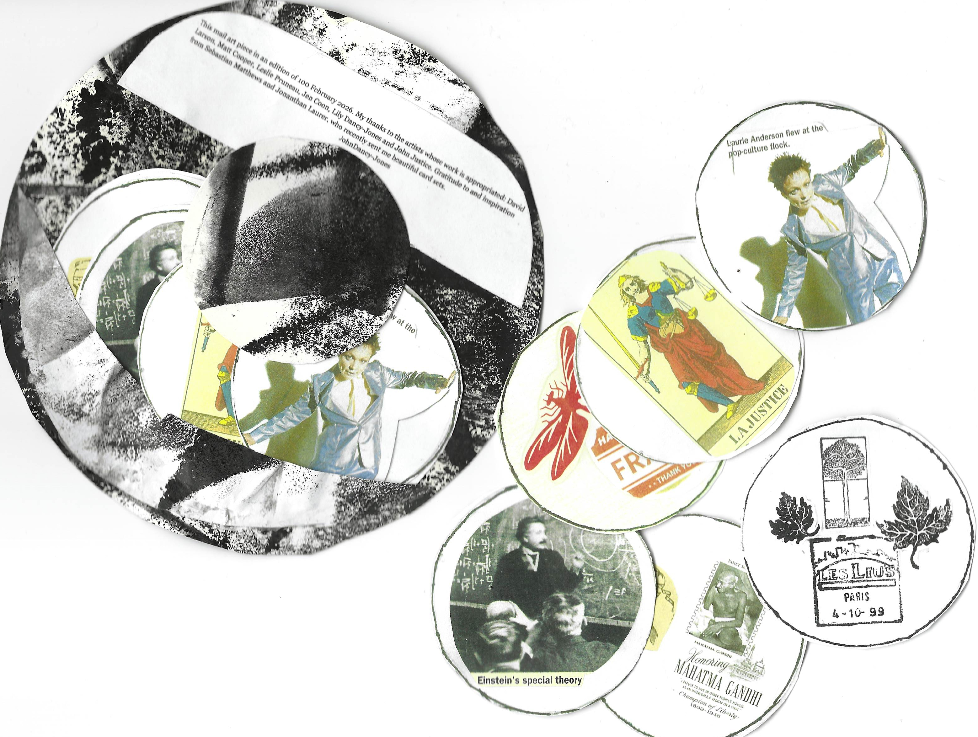
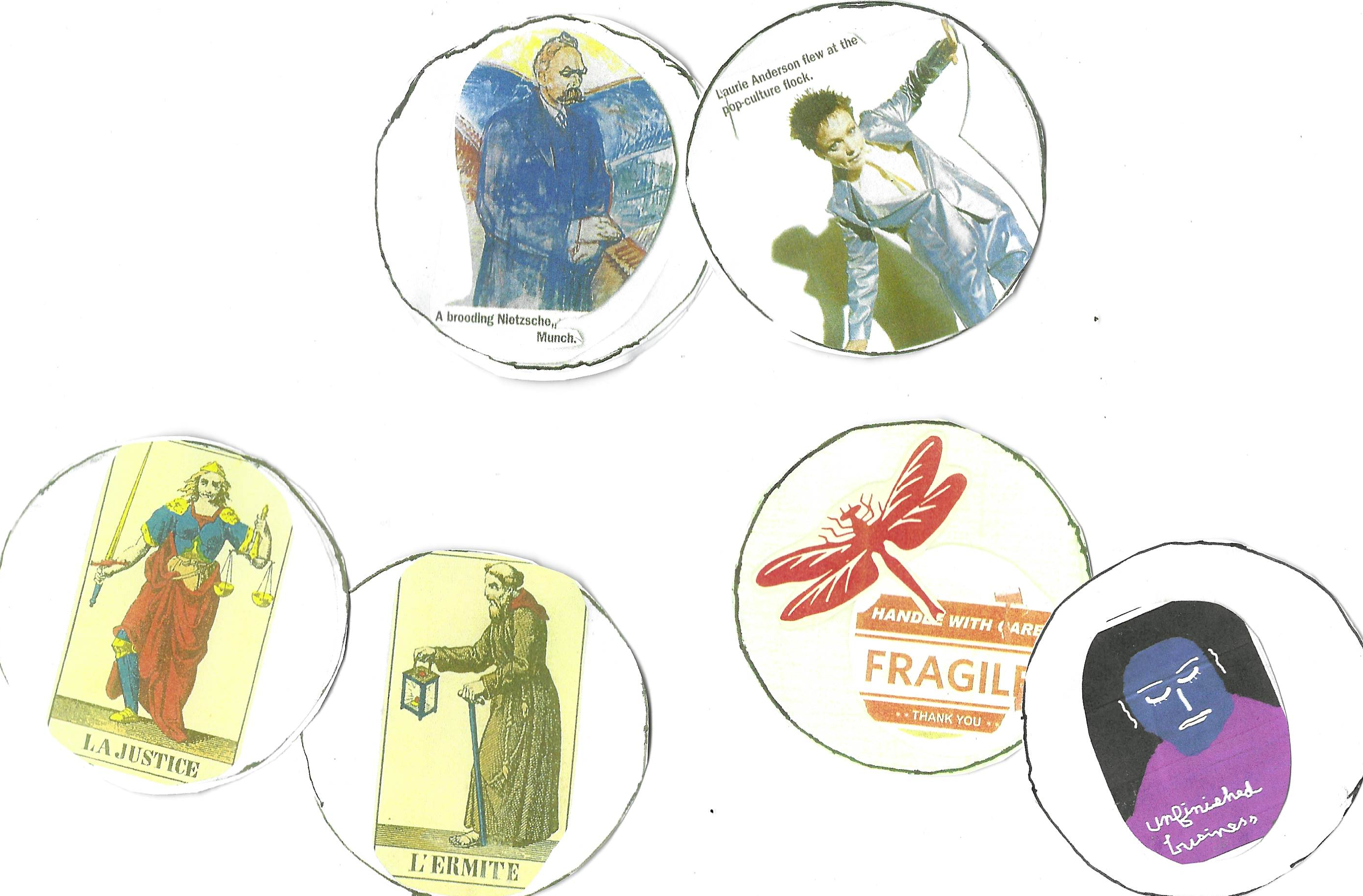
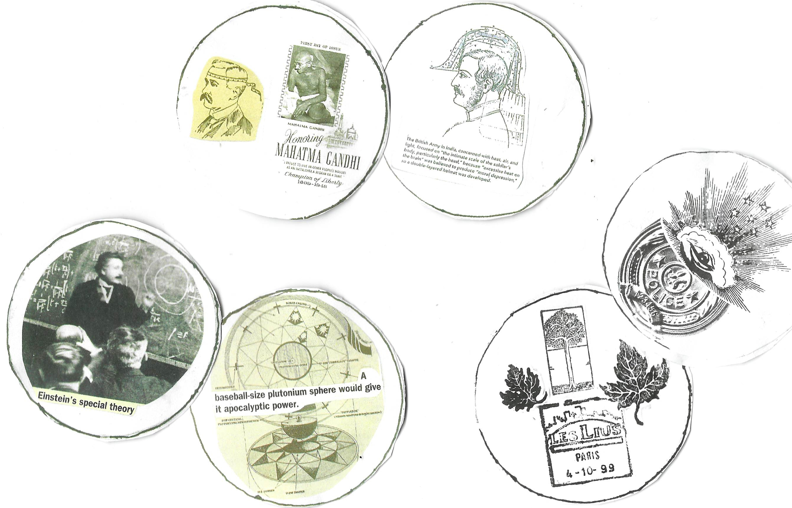
Many thanks to the artists whose work was appropriated: David Larson, Jen Coon, Leslie Pruneau, Matt Cooper, Lily Dancy-Jones and John Justice. Gratitude to and inspiration from Sebastian Matthews and Jonathan Laurer, who recently sent me beautiful card sets.
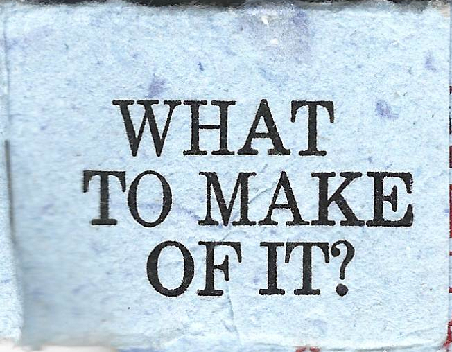
What To Make of It? What will YOU make out of it: mail art
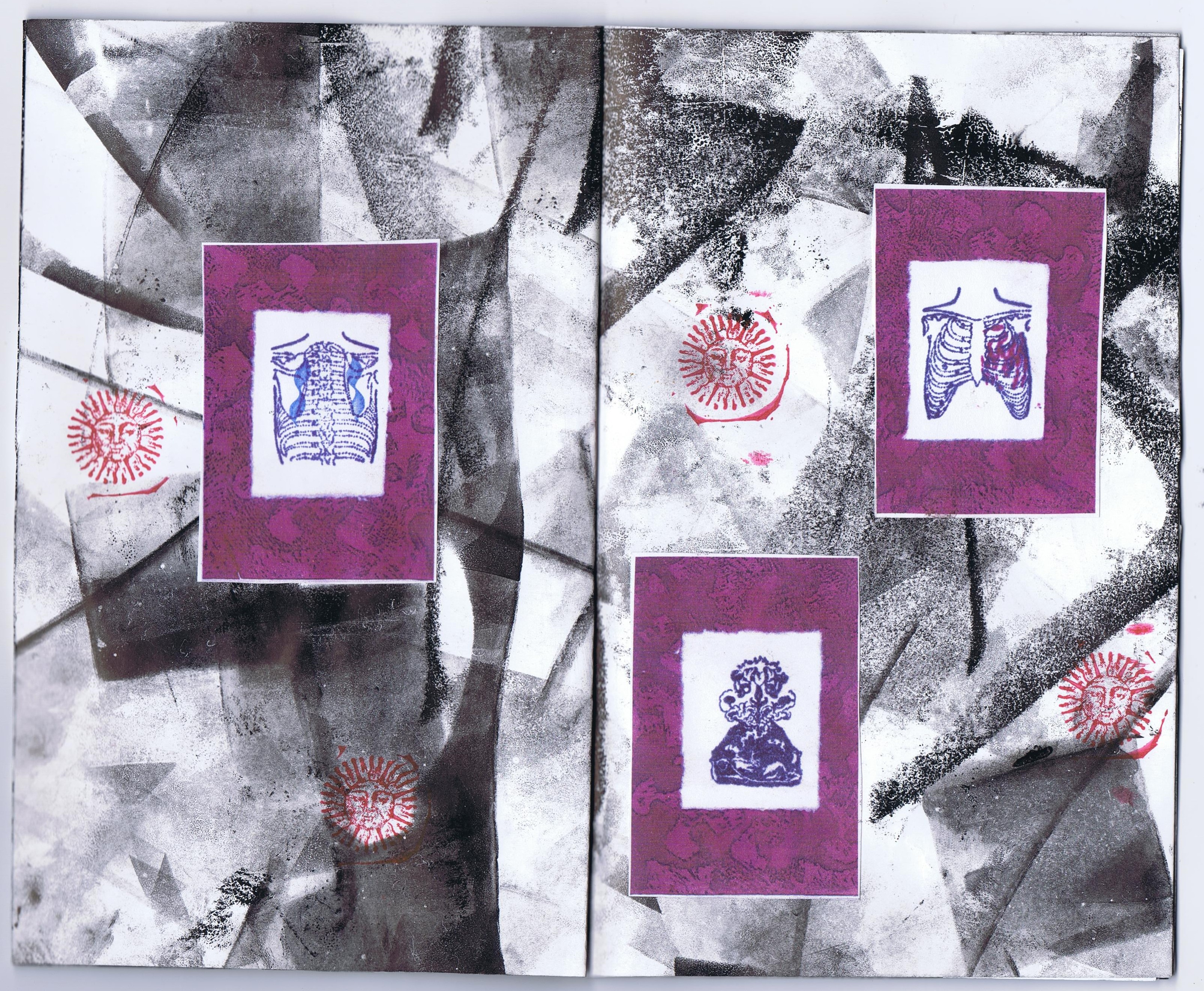
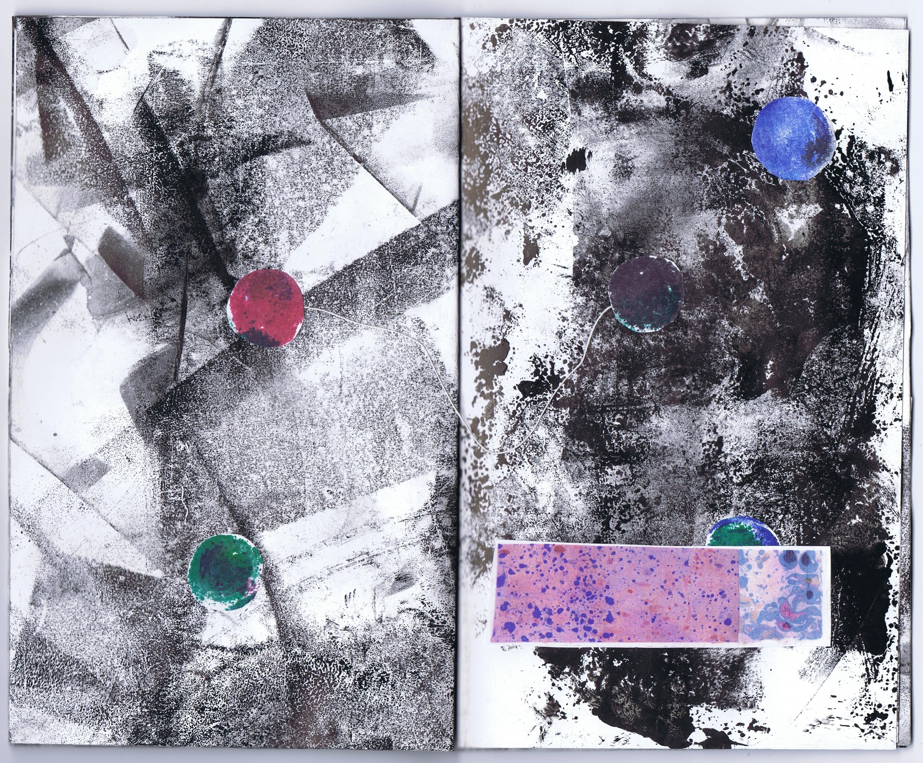
Helene’s fury found me two-thirds through a major mail art project. With the content committed to a pre-election release, I found a way to keep working on it, printing by battery light with a helpful mirror just outside the studio on sunny days. This piece was always going to be “rustic,” even for me, but it was finished in near desperation, taking breaks from printing to shovel silt out of the book arts barn.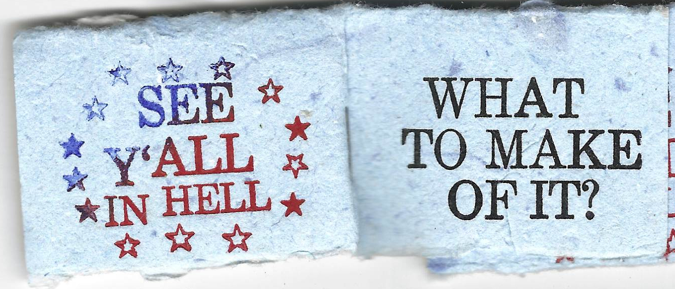
The inspiration for this piece came from Leslie Pruneau, a talented and well-established Raleigh artist, who sent me a wonderful tiny book as a gift in return for my mail art. As soon as I saw it, I knew how I wanted to use the hundreds of one inch strips of hand-laid paper left over from Natural History of Raleigh covers. I folded and trimmed about a hundred little books and started printing the draft of images from my stock of rubber stamps and blocks.
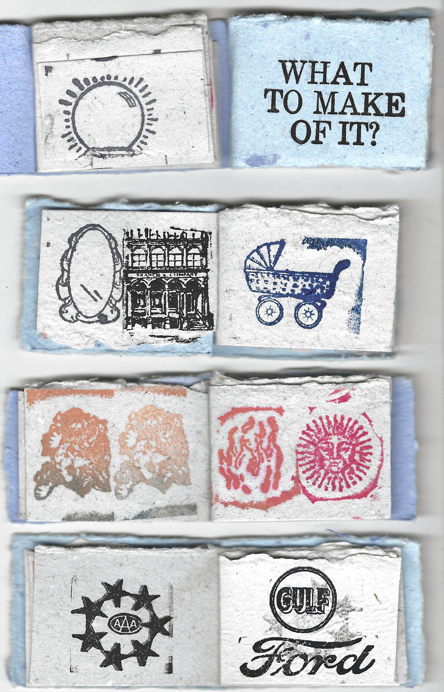
The idea map emerged from thinking about these pictures of untold parables. As always, chance, opportunity and random influences guided me.
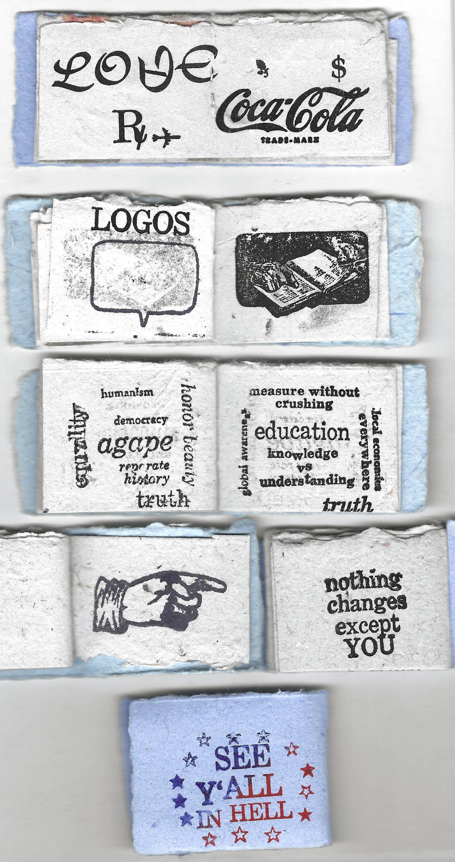
The closing image is from Andrew Lane, a zine artist whose work I first encountered through the 2020 Asheville Zine Fest exchange. I picked up his sticker at the Boone Bound book arts festival and put it right in front of my work station. So sad that Reagan, Newt Gingrich, and the bubbling forces of social media have brought truth into such peril.
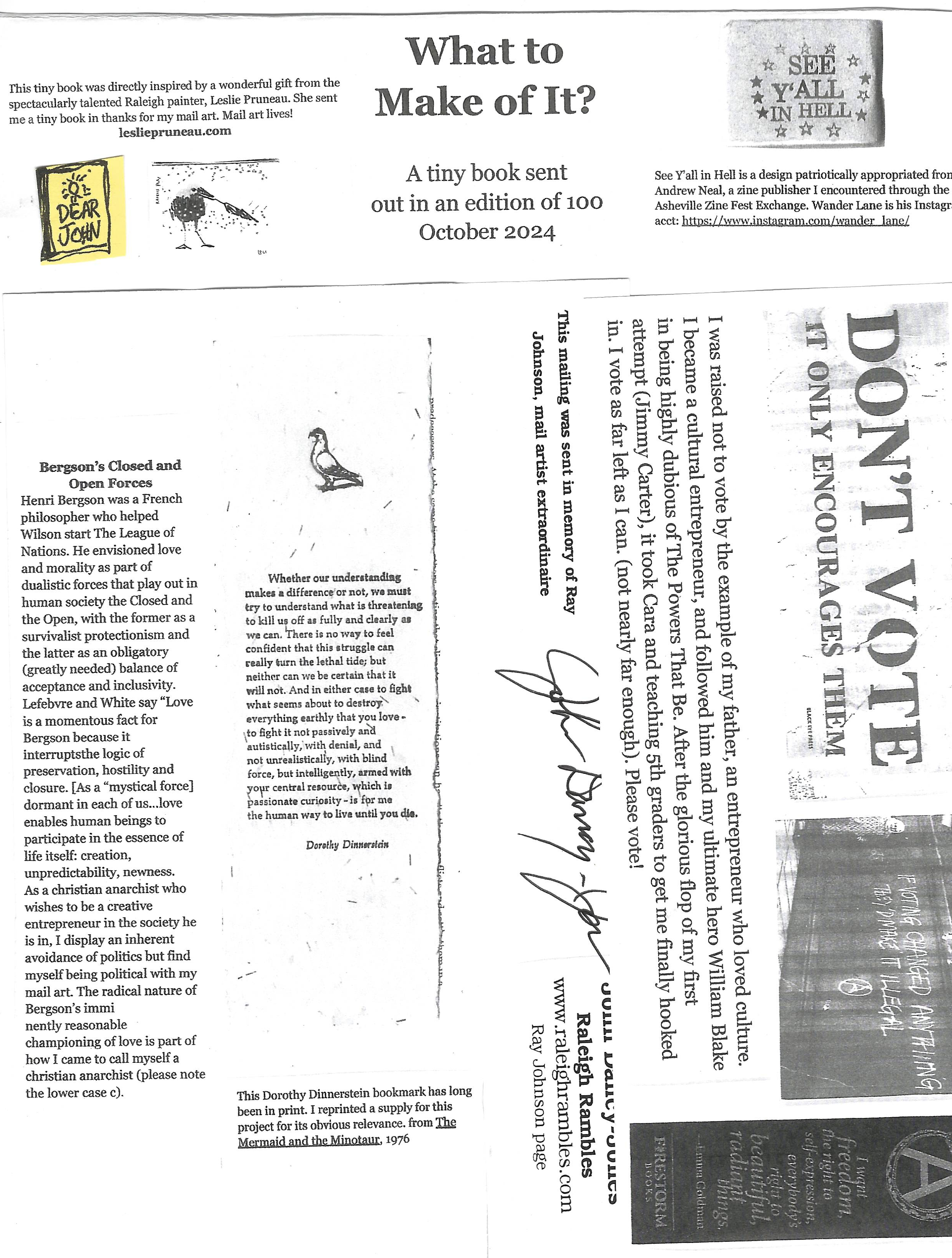
The outer wrapper was designed to suspend the book in the envelope, to help that object make it through as a piece of first-class mail, which is much more tightly restricted than in the past. The Dinnerstein quote bookmark, re-printed on the fly for this project, has a one word omission error. It is such a fantastic quote.
Happy Trails, whatever Nov 5 brings.
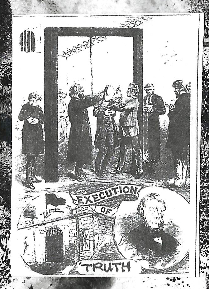
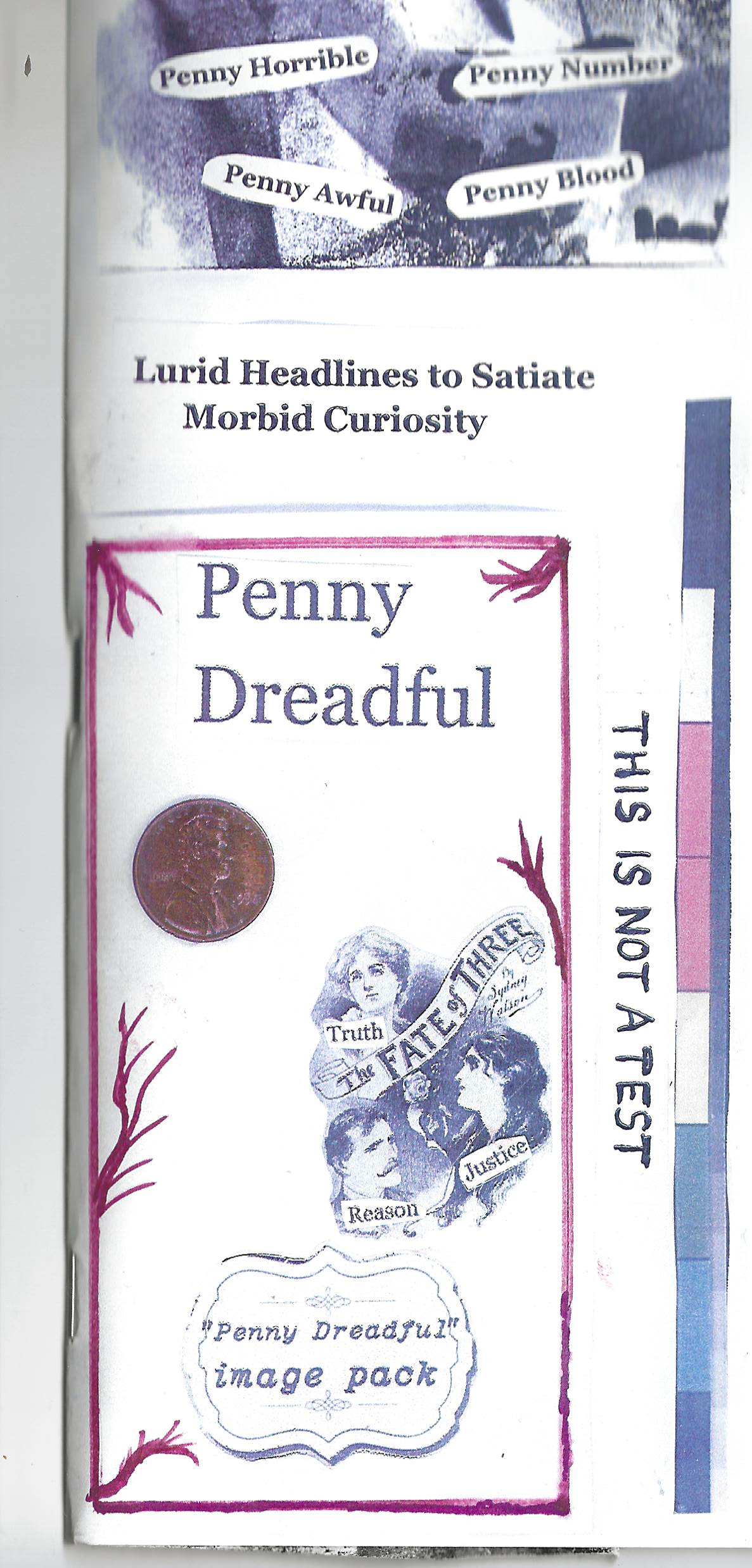
PENNY DREADFUL an essay in small print
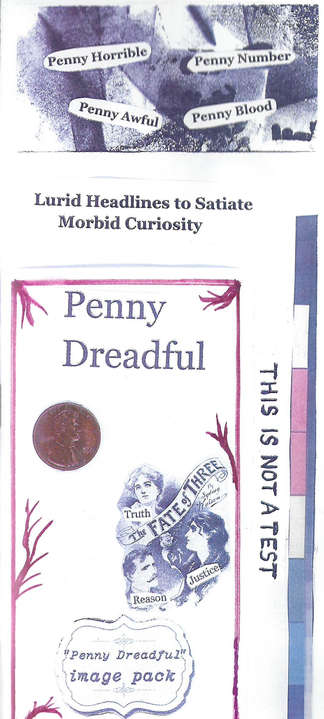
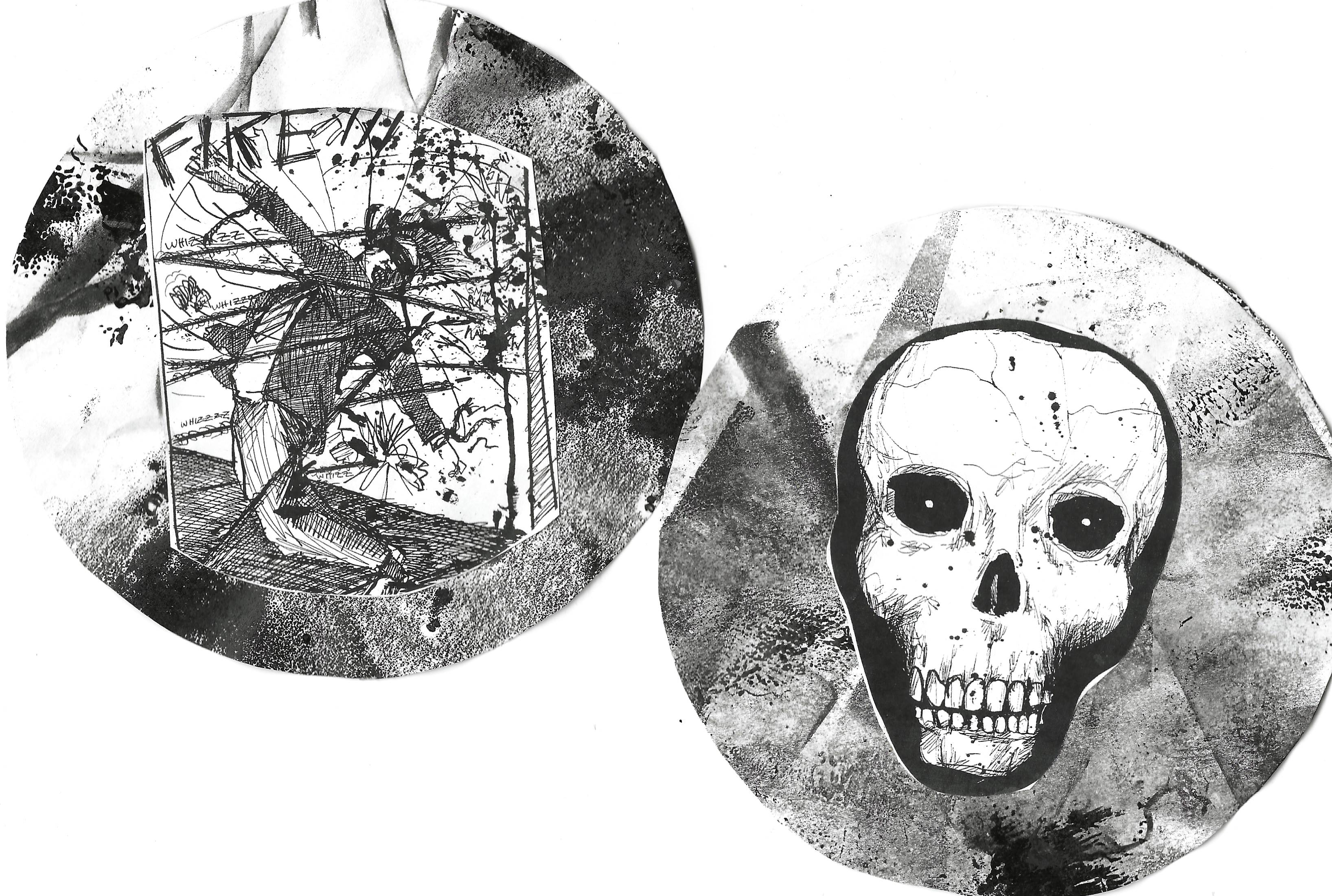
My latest and biggest ever mail art is out in the world in an edition of 120! Based on an early form of street literature I learned about from Dr. Charles Edge at UNC-CH in the early 70’s. I previously used the format in a self-publishing project with 6th graders at Glenwood Elementary my final year in Chapel Hill. Sent one year from an inauguration that will be a watershed for our country – one way or the other.


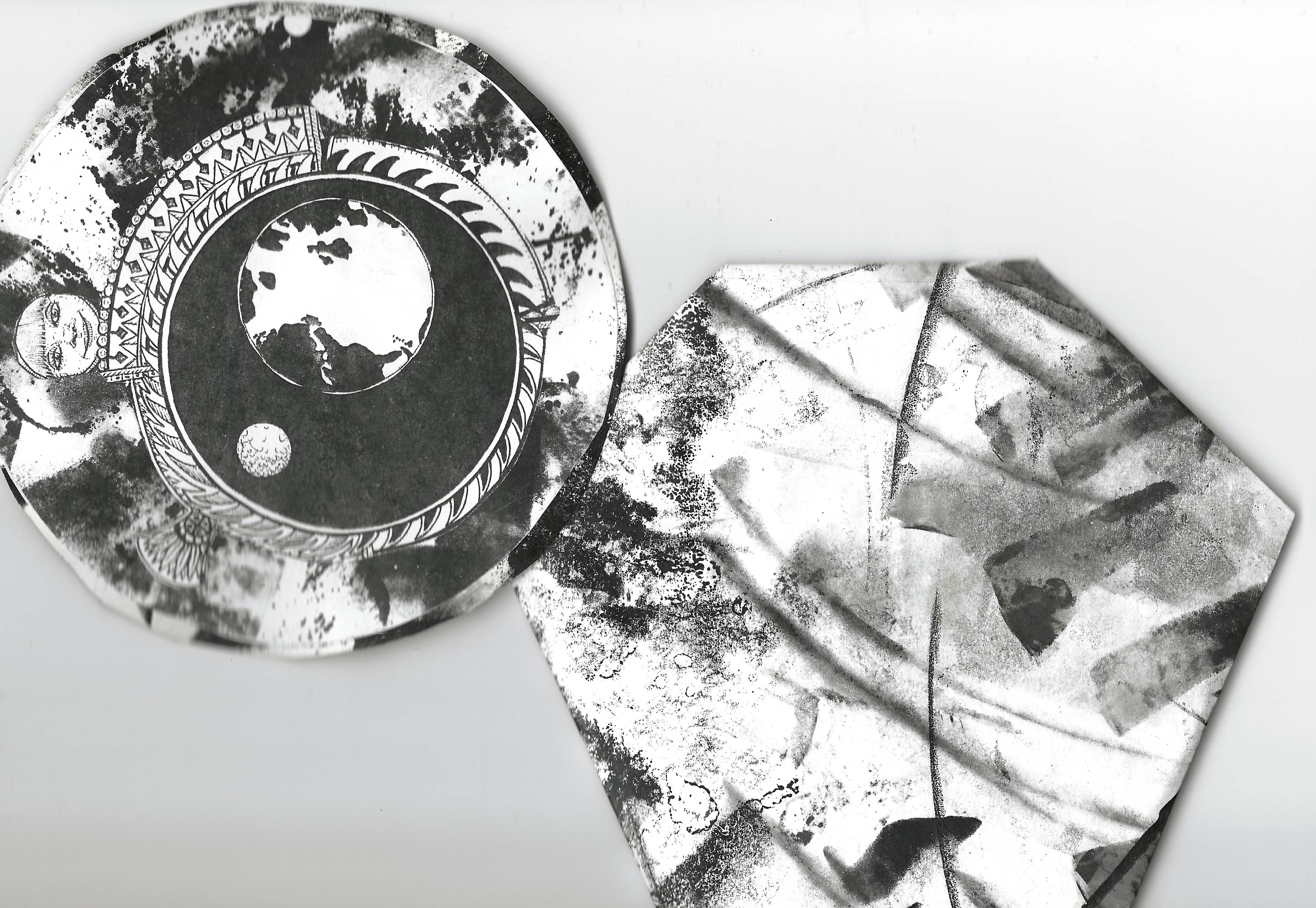
The format is a 2-sided color photocopy enclosing a small booklet made of an 11×17 sheet strategically used to clean off excess ink from the platen after letterpress printing nature book covers. I also used these for the zine version of my pandemic mail art piece, Plague Daze.
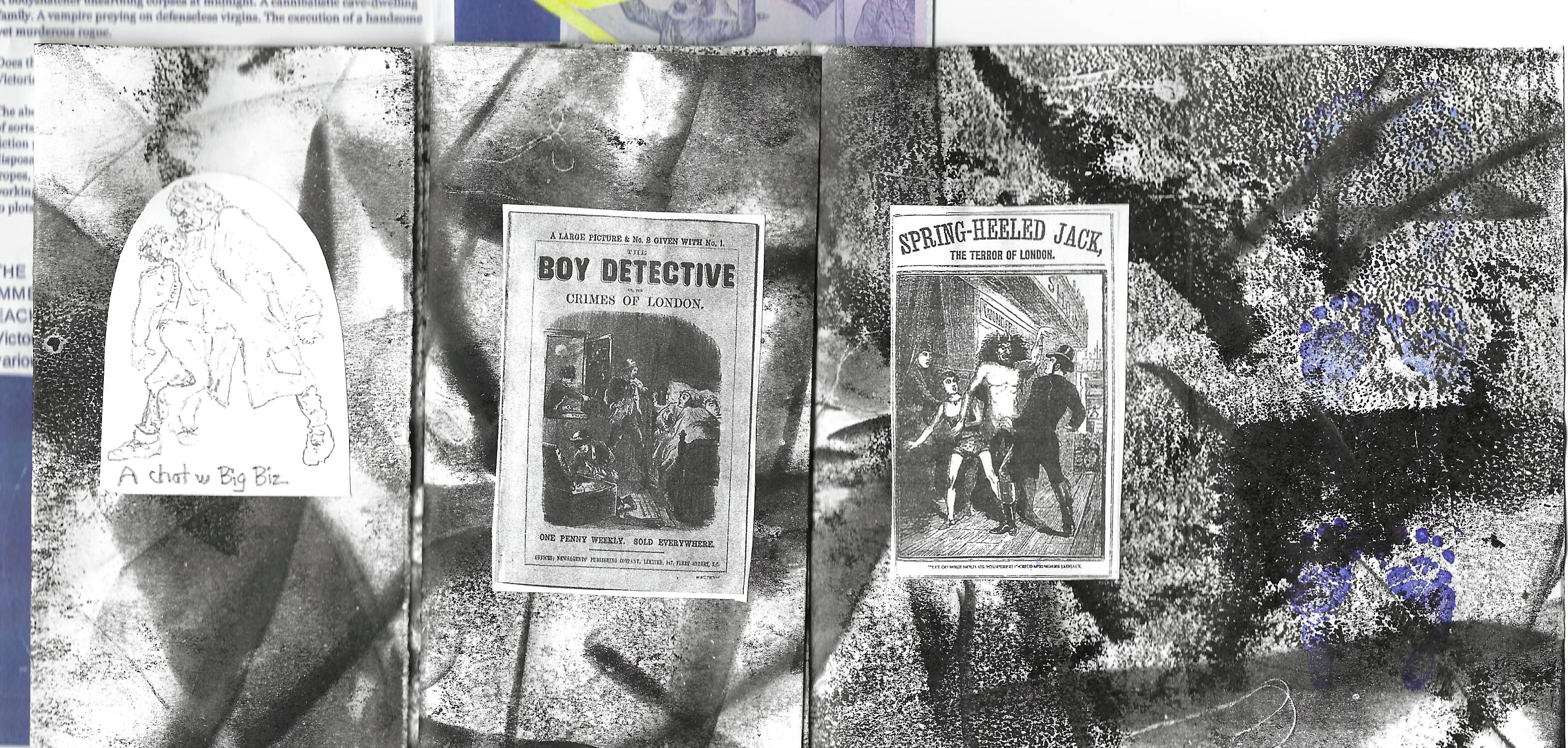
Historic images of Penny Dreadful covers and other historical print images (occasionally modified) were cut out and glued into the booklet. Over 3000 pieces! Not all are shown.

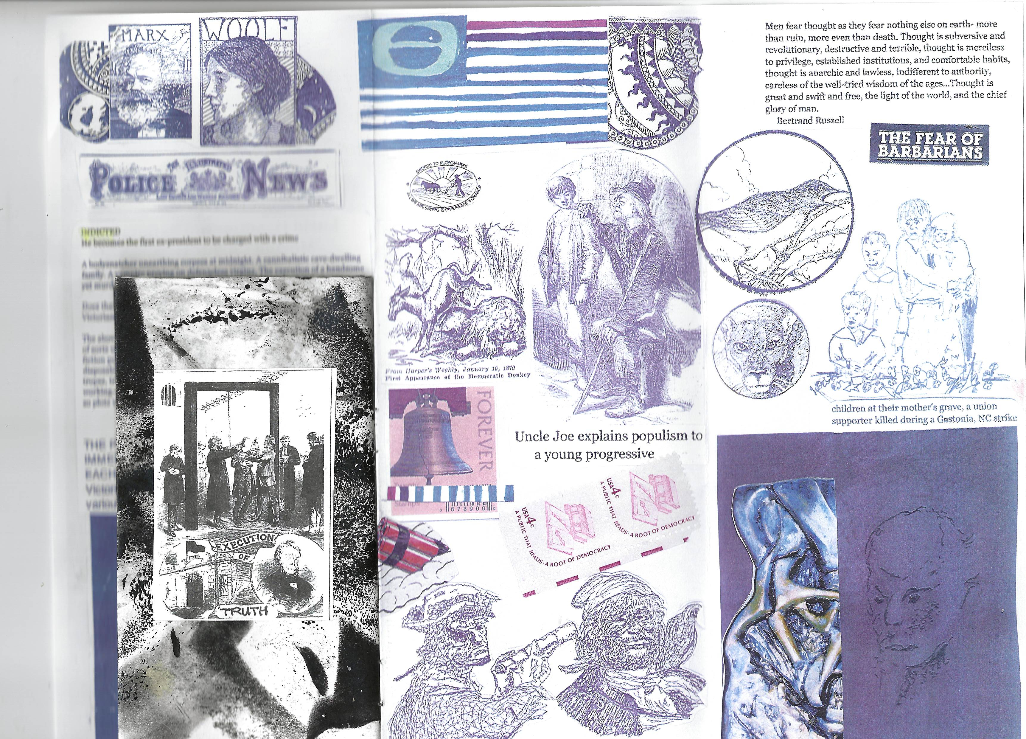
Throughout, the reproduced pencil drawings are my tracings and re-drawings of print images. Hilariously, the mounted penny is the specific reason this mailing is slightly too thick to qualify as first class by current (much stricter) regulations. Also, mounting the penny with glue on the back side is surely a defacement, which is a federal offense. I love the subversion but I fervently hope none get returned (109 are in the mails as I write).
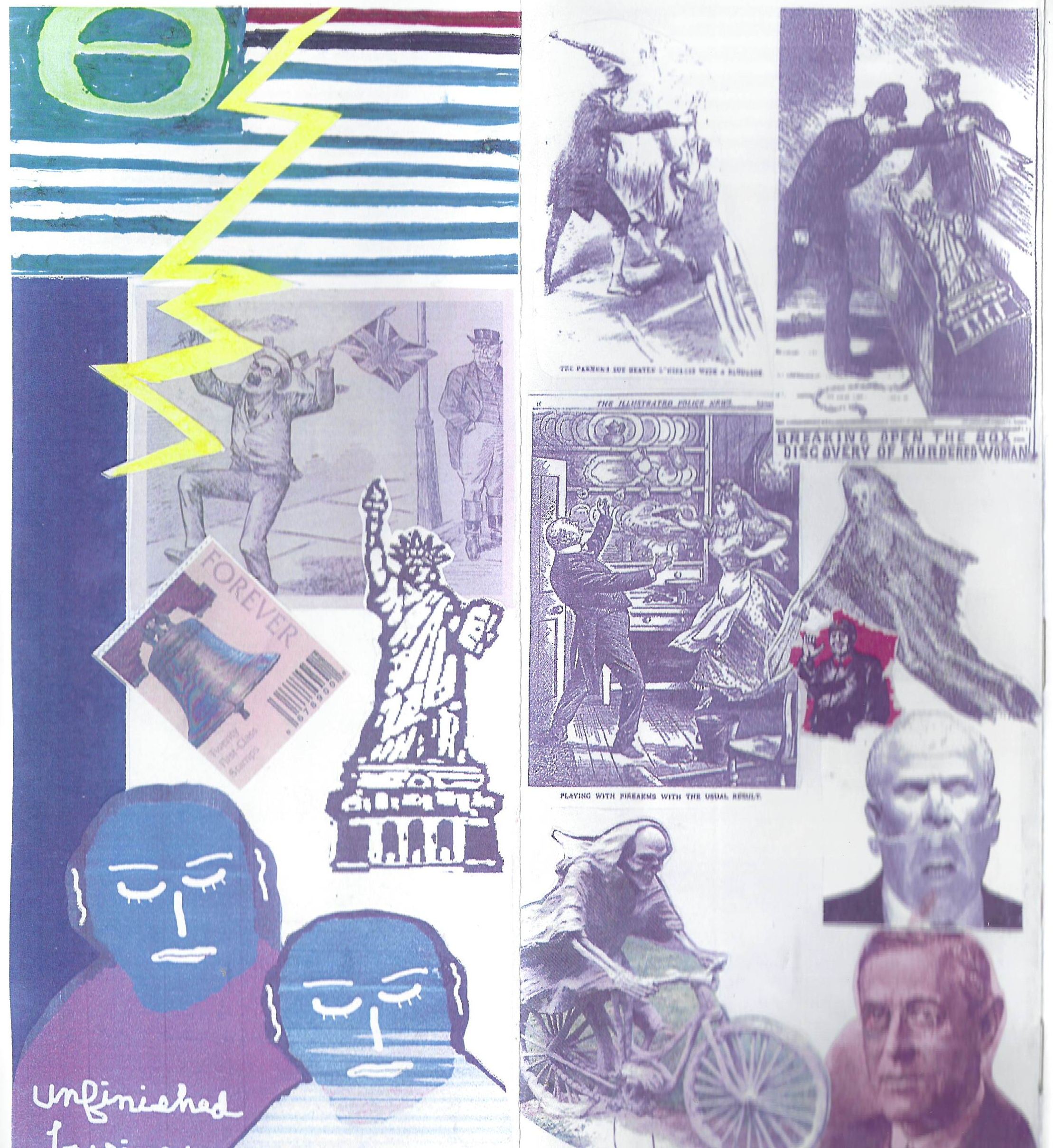
A big thanks to contributors of images: David Larson, John Justice, Jonathan Laurer and of course the online resources for Penny Dreadfuls. This mailing was sent in the memory of Ray Johnson, correspondance artist extraordinaire. Richard C, Ray J’s curator, and John Justice received draft versions of the project which were essential in finalizing the final design. Mail art lives!
Our country and its democracy, such as it is, WILL survive – American history is filled with far worse episodes. Besides, the really big boys are not going to let our lucrative systems break down – and The System is inexorably getting more progressive and global all the time – but this has been a hell of a wake-up call for all of us. God bless us all.
Feedback on Penny Dreadful
Mary R: Shadow and light conjoined in a delightful dreadful death of democracy, a fine memento mori for Ray….. most grateful and amazed!
Alyssa S: It was such s surprise and delight to receive! I’m looking forward to spending more time with it. Each look, I catch something I didn’t see before.
Cheryl C T: There’s so much to see. Each time I look, I find another interesting detail.
Lee M C: I am really moved by this work..opening it and being..yes this is today and yesterday and the impending proverbial bad penny! amazing imagery , prophetic synchronicity
Eric N:Got my Penny Dreadful mail art a few days ago. Thank you so much–a remarkable assemblage. I love it
Marcia C: What a wonderful surprise to have your very cool little book arrive in the mail. Thank you so much! Penny Dreadful is a rouge book that has some wonderful fingerprints on it. I can see all your hand work and paste and stick and fold.
Jen C.: You have lit up my imagination once again, John.
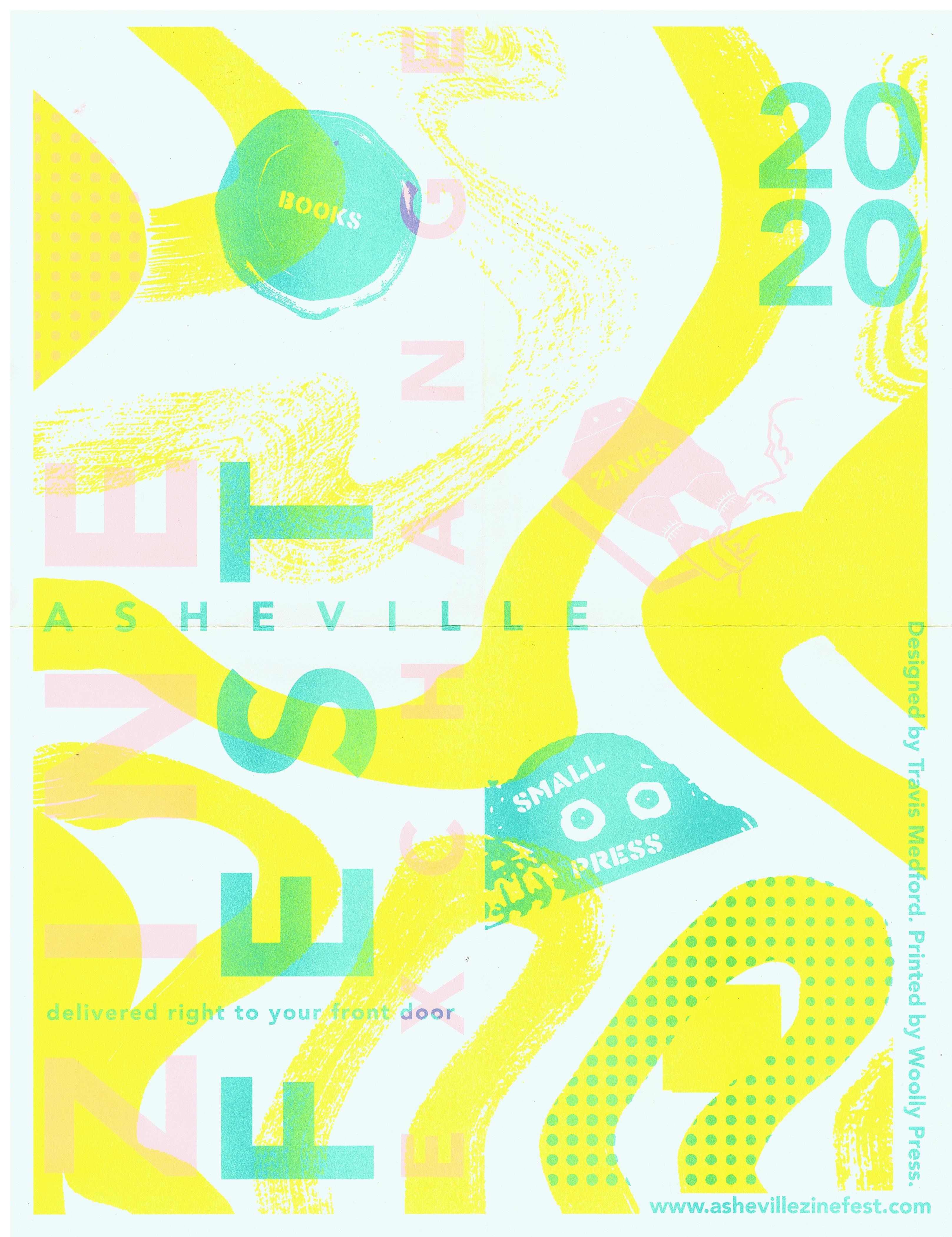
Plague Daze Zine Features in Asheville Zine Fest Exchange
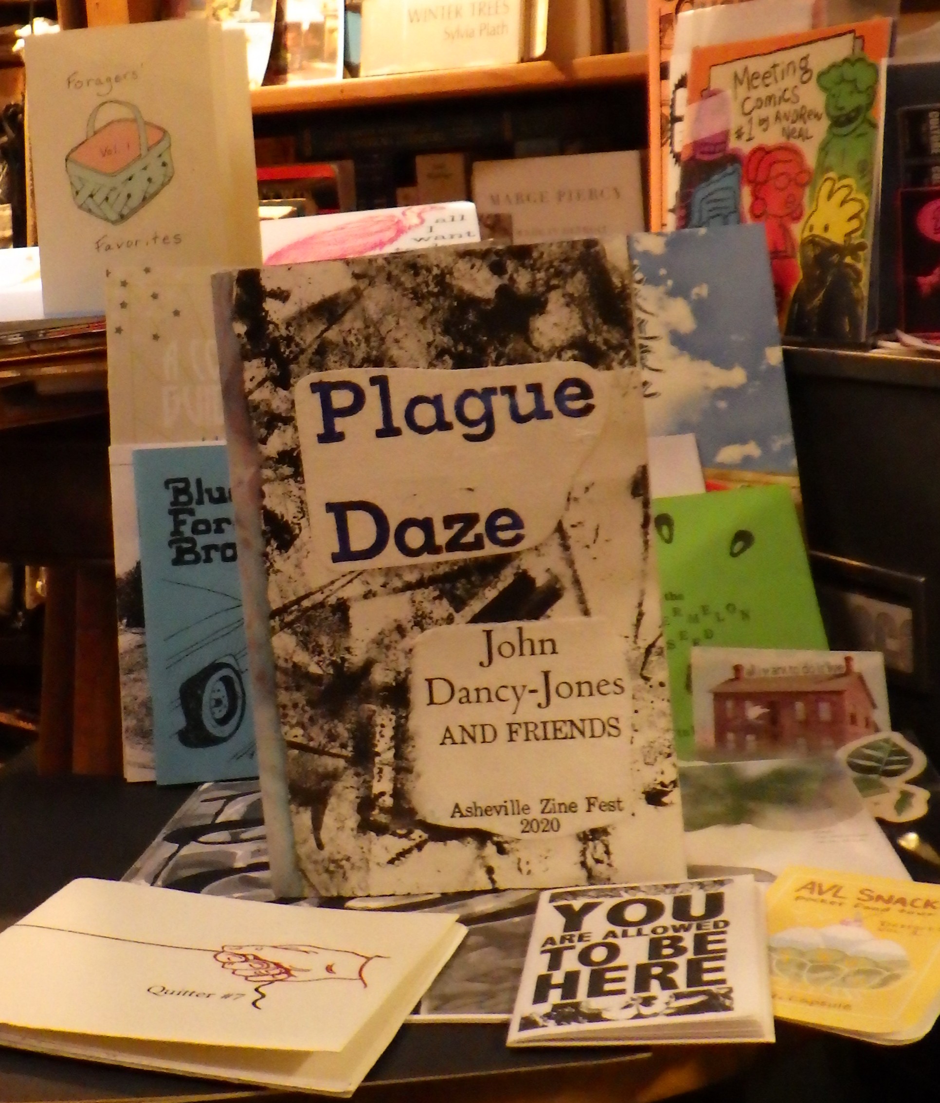
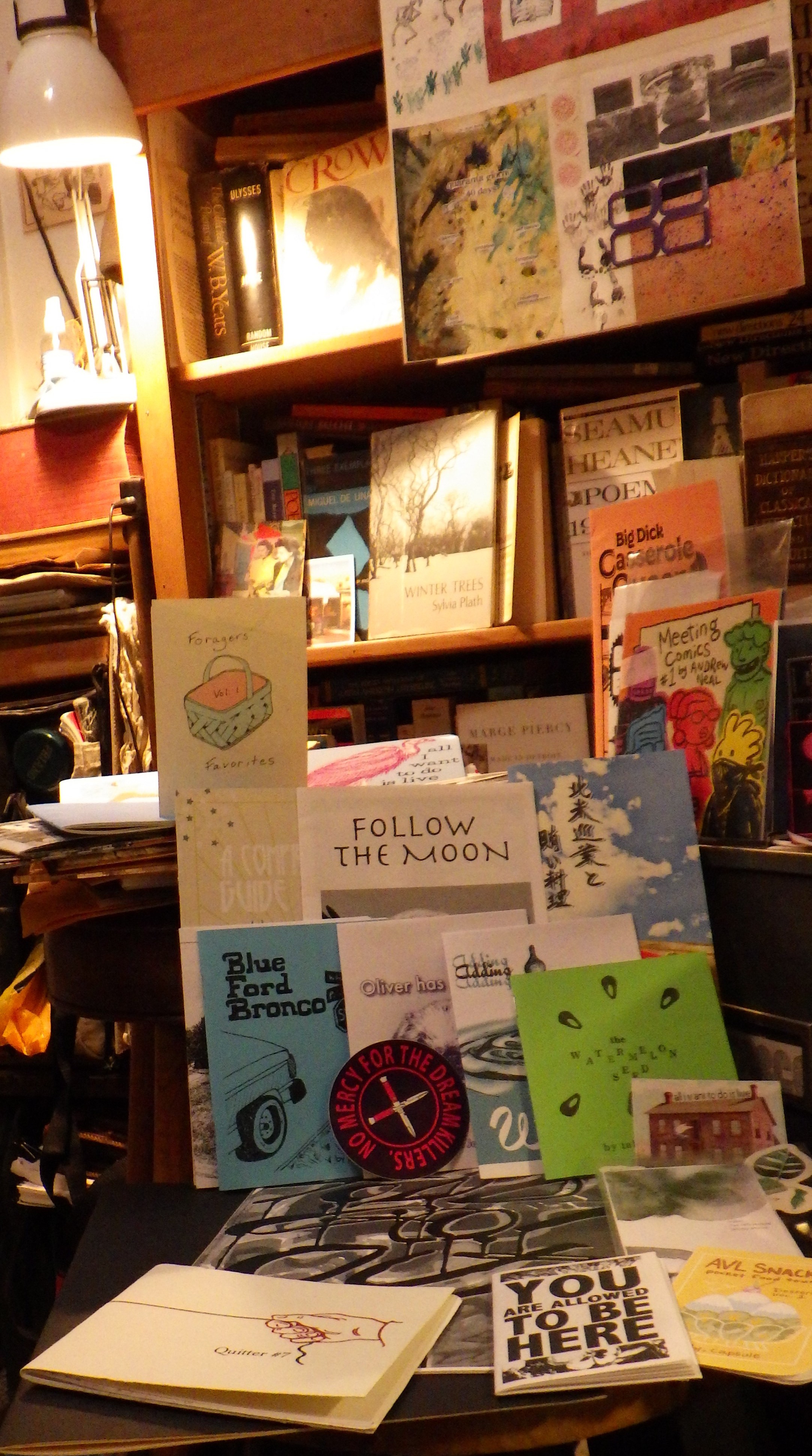
September 20th, 2020 marks the scheduled day for the Asheville Zine Fest, a long standing venue for the numerous micro-publishers in Asheville as well as zinsters across the state. The Paper Plant was set to participate, and I was very excited to network with other publishers and display the Paper Plant catalog at The Center for Craft in downtown Asheville. Alas, the event was cancelled but then replaced by a wonderful idea: a zine exchange among the publishers. That motivation pushed me to one last version of Plague Daze, the May 2020 mail art project that I also had converted to poster form for a mail art show at The Flood Gallery in Black Mountain. Above is the zine I created along with a spread of the zines I received in the exchange.
The packet I received contained a predictably wild variety of graphic designs and content. The organizers used the now-closed Asheville Bookworks as headquarters, and Laurie Corral, Jessica Smith and Mica Mead and Colin Sutherland of Woolly Press, a west Asheville publisher and risograph shop, worked to make this happen. I enjoyed all the entries, particularly Laurie’s risograph project “Forager’s Favorites,” and a wonderful textless mini-comic by Carrboro artist Julia Gootzeit called “B-Sides.”
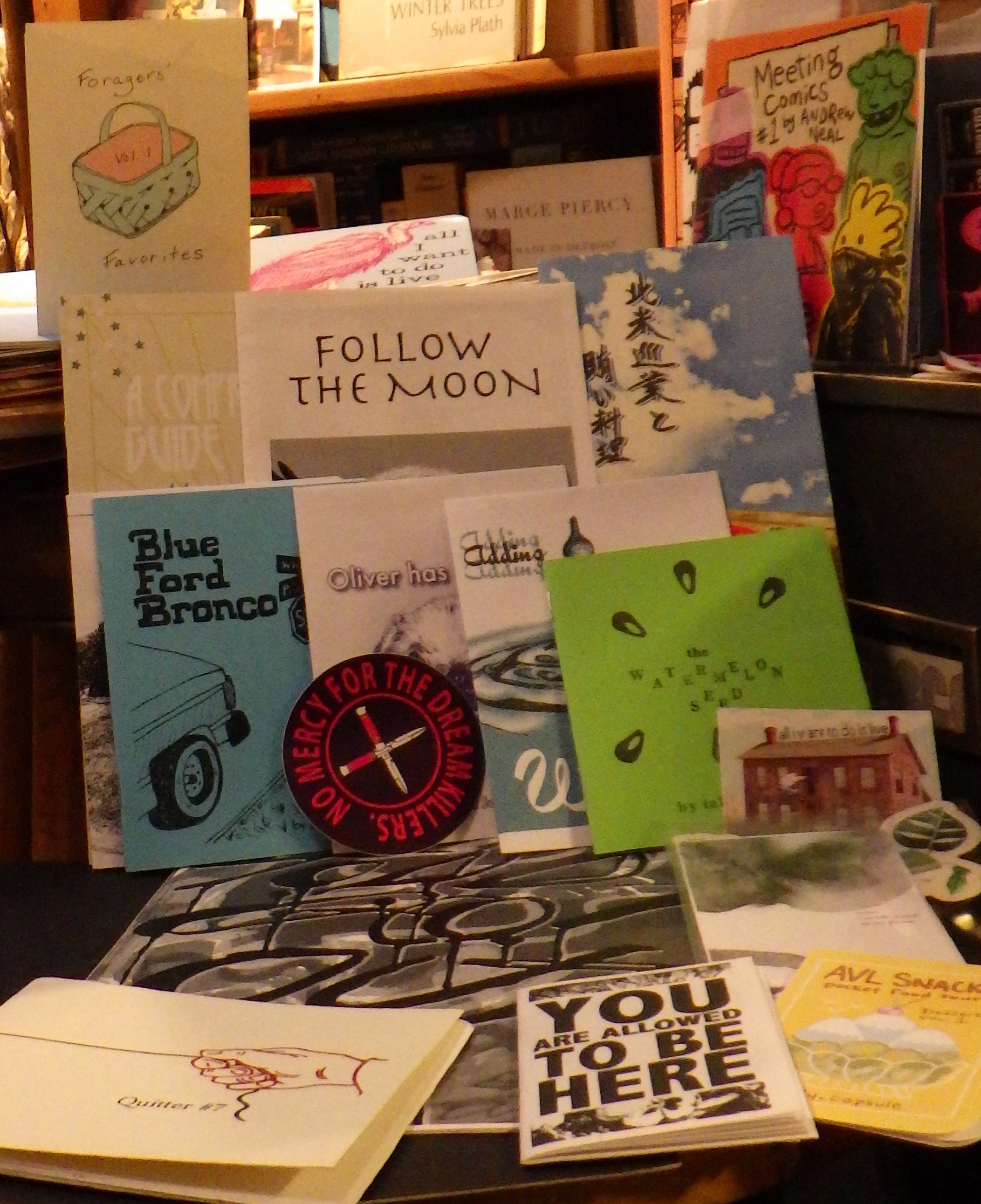
I enjoyed all the entries and hope to meet many of the publishers in person at next year’s Zine Fest. A dominant theme in the collection above is risograph work, which was new to me until I discovered Woolly Press a while back. To quote the School of Design at the University of Illinois,
The Risograph is a stencil duplicator. Think of it as a cross
between screen printing and photocopying. The Riso prints
one color at a time in bright, vibrant colors. It is ideal for
posters, graphic prints, zines, comics, and other graphic arts.
Each color requires a separate print run. The colors are like strong watercolor tones, and I like the effect very much. Asheville is a hot scene for alternative arts, and zines and fine art printing are no exception! Below is a description of the rather laborious process used for my own contribution.
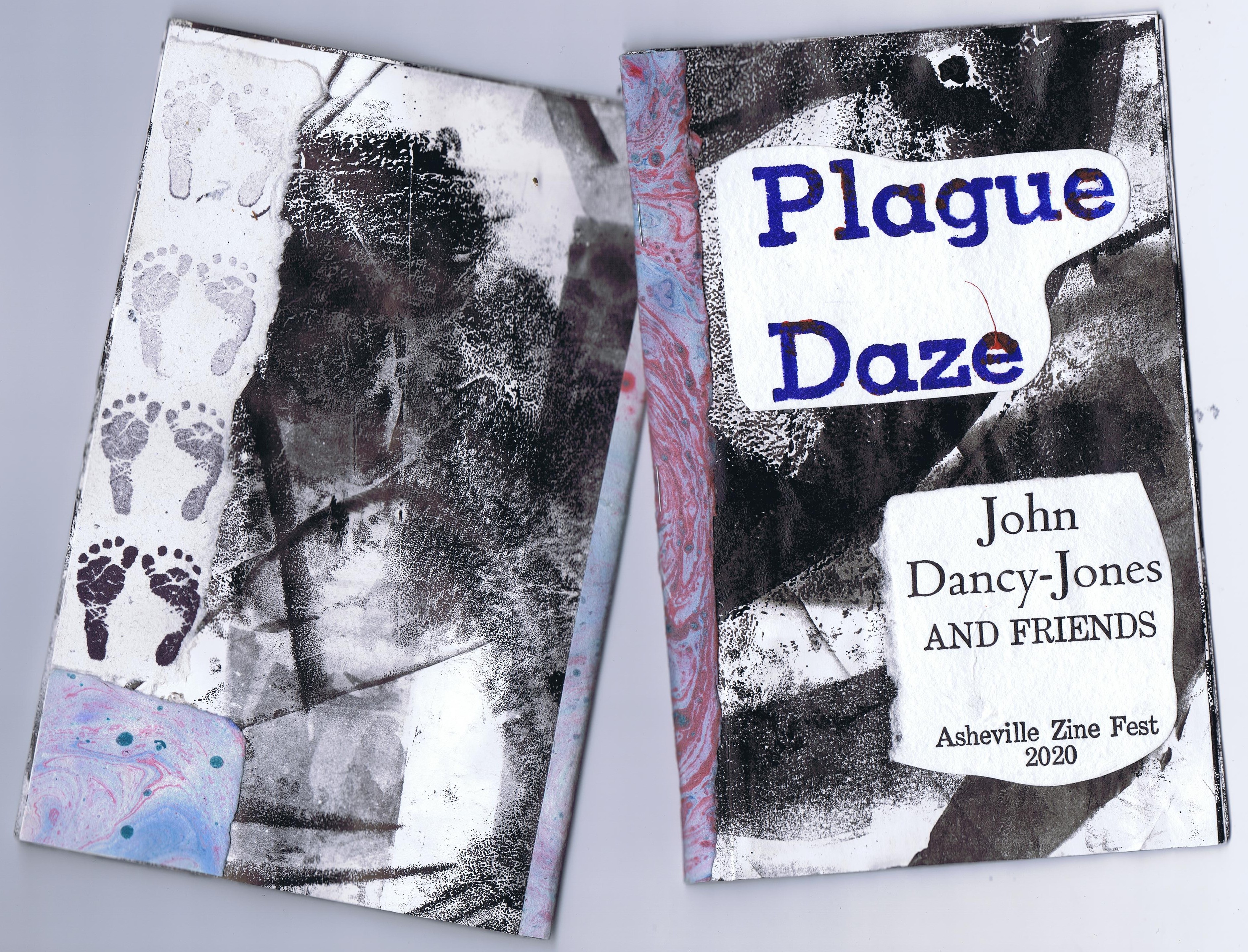
Plague Daze started as a mail art project sent out on May 1, 2020. Rubber stamping was the primary means of making images, with collaging of hand-laid paper some monoprinted and marbled. The poster version I created featured a collage and marbled version of the “40 days” concept from the mail art piece. That image, along with the art of guest artists, was color photocopied and then cut out and glued on to the background pages. Those pages are my secret ingredient for this zine. In printing covers for my book, The Natural History of Raleigh,” I set aside a ream of 11×17 copier paper to use in clean-up. The excess ink was removed with these, leaving strategic marks of the curved platen, the brayer marks, and various accidents of the cleaning motions. I collected over 200 of these and when the call for a zine came, I knew these were the perfect background for some pandemic content! Enjoy the contents of my zine below, and be safe!
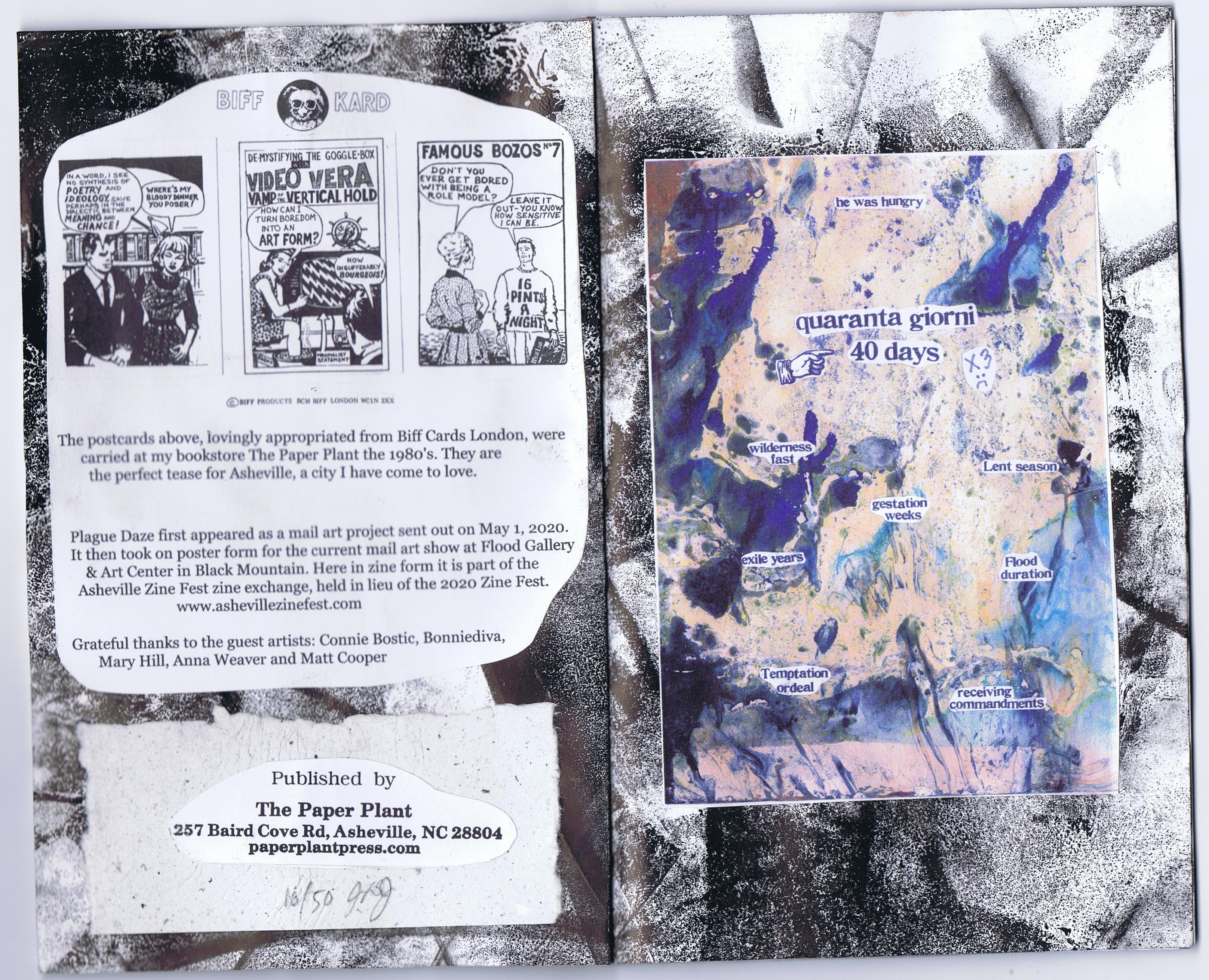
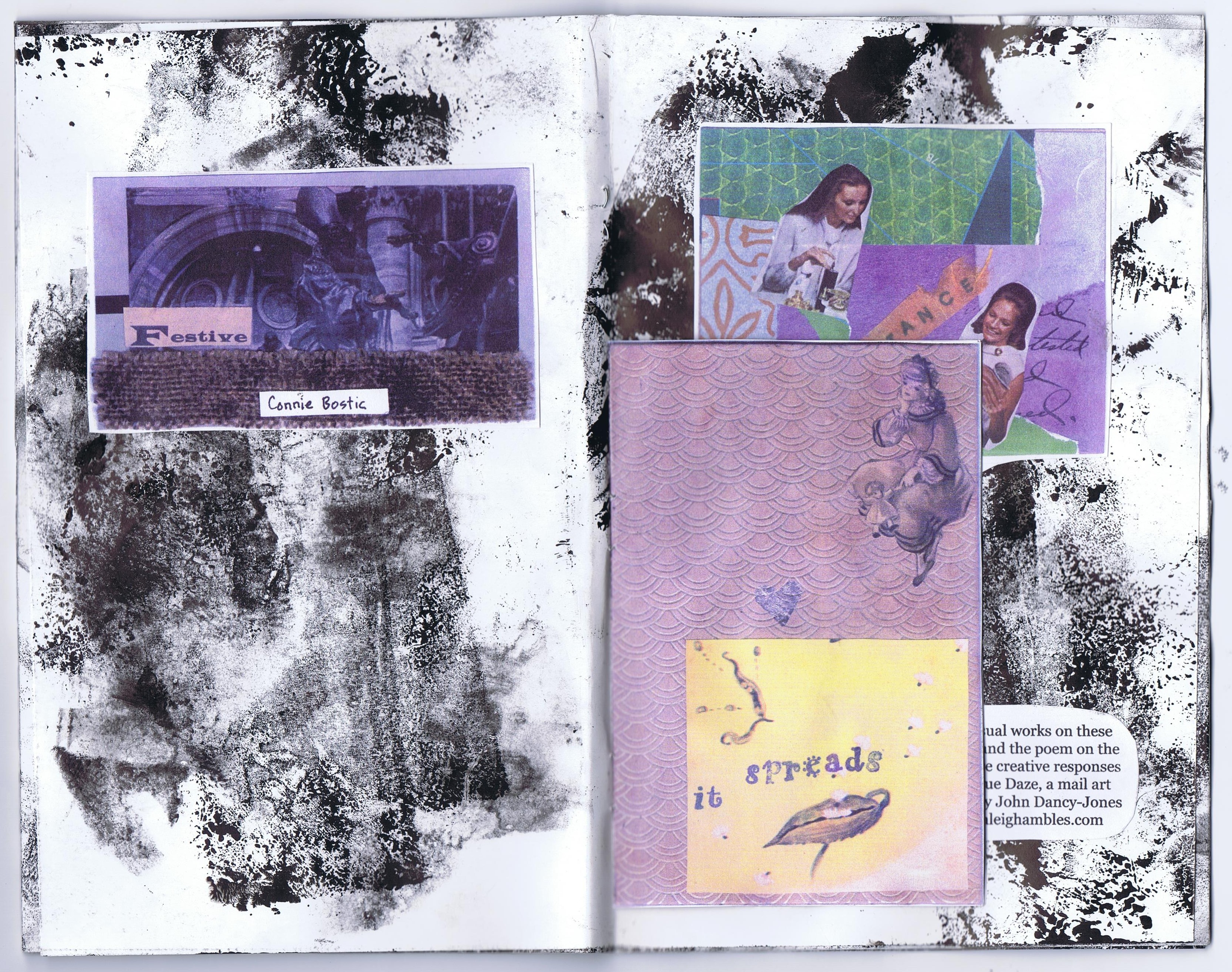
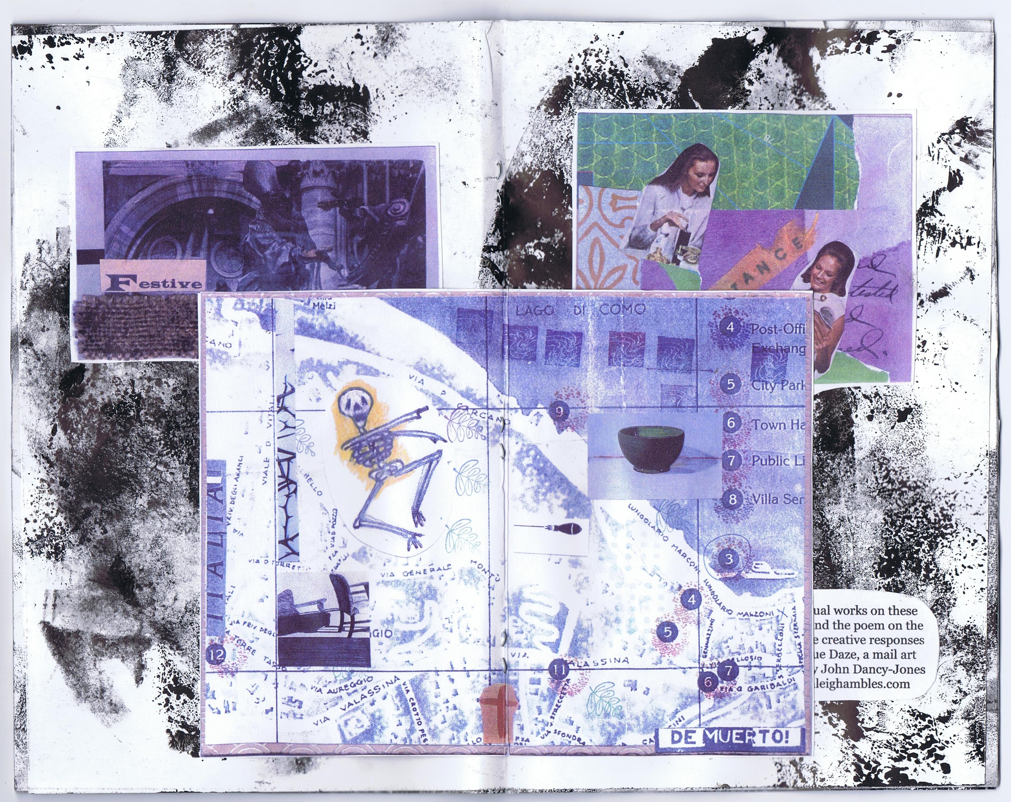
Connie Bostic is a founder of the River Arts District in Asheville, and a leading figure in the Black Mountain College Museum community.
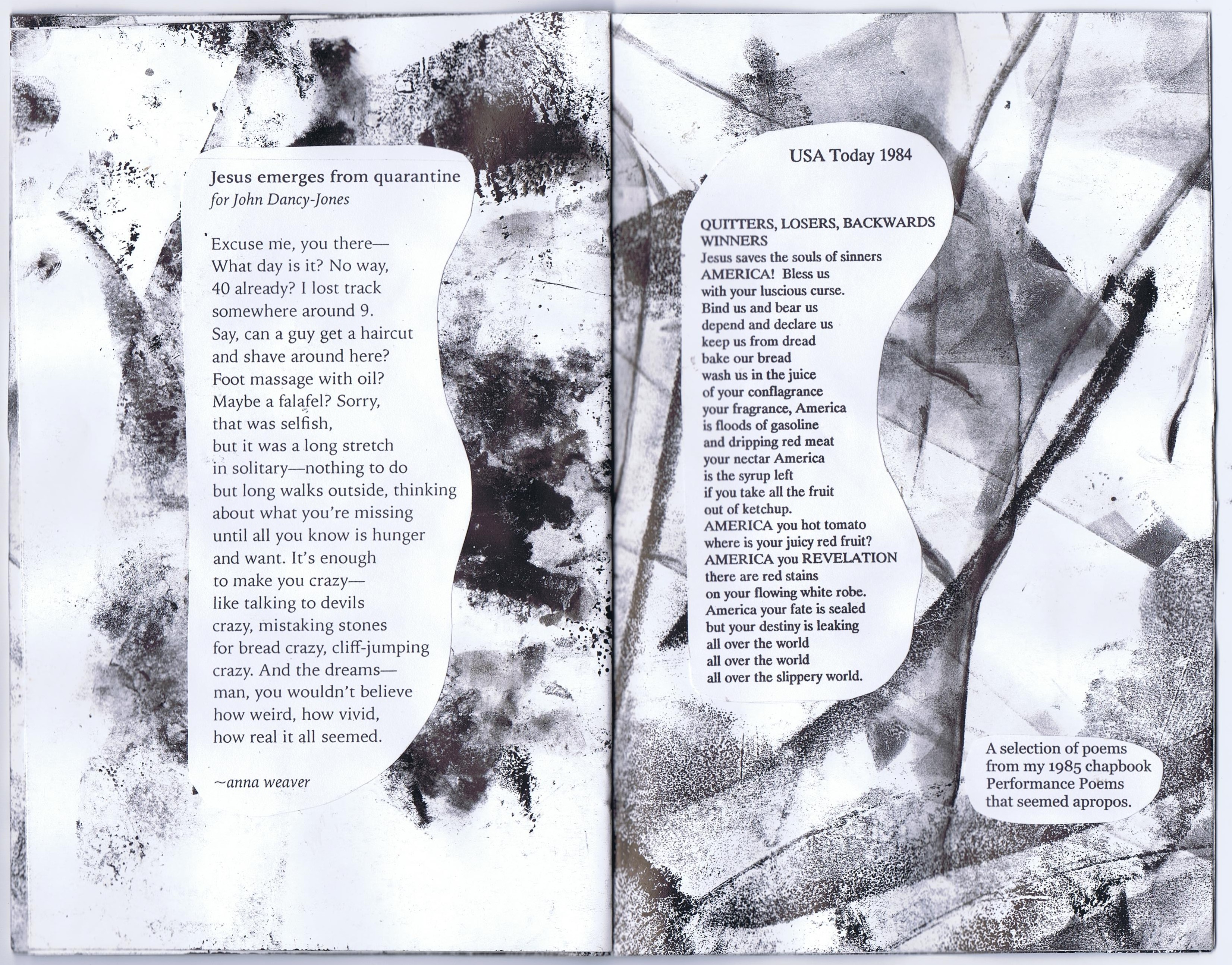
You may recall that Mary’s booklet, reproduced and stapled into the middle of the zine, was featured, along with the Anna Weaver poem below, in a post here. (full size scans).
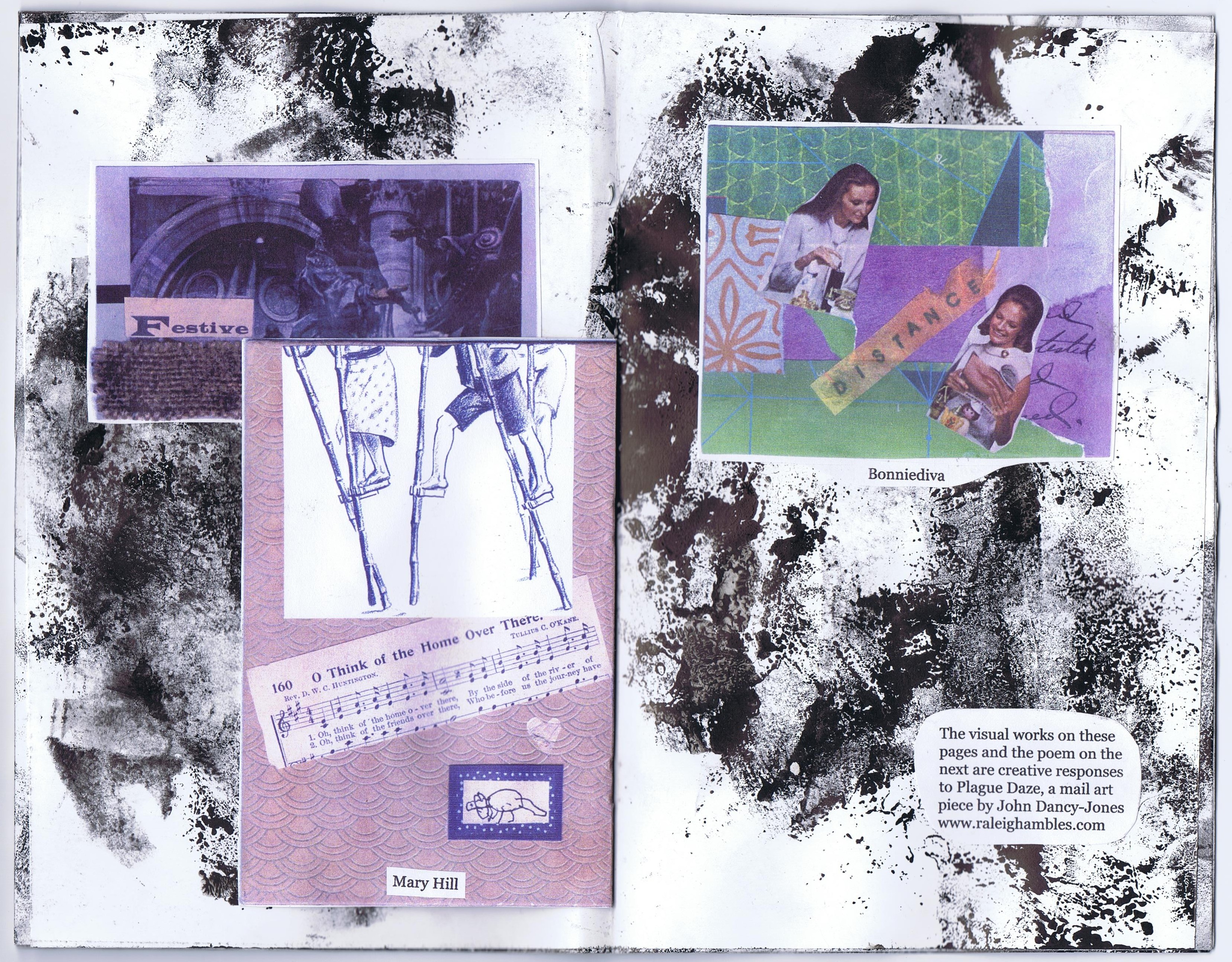
Bonniediva is a mail artist with whom I came into contact through a national mail art organization.
Sure honored to have this set of zine publications for the Paper Plant archive of zines and other alternative art and publishing from the 1980’s.
Mail Art Response Provides Pandemic Panacea

Recently received mail art includes responses to Charts of the Universe 2020
We are extremely lucky, thus far at least, to be in our little mountain cove far from the hotspots during the trying times of Spring 2020. Just as the news got really bad, I was in the midst of mailing out a major project – Charts of the Universe 2020. Suddenly mail art seemed like a really good idea, and actually made the news, described as “a charming trend” on artnet.com. I got several nice responses to my Charts project, including some wonderful mail art pieces to add to my large collection.

Anna Podris created the image above as the centerpiece of her tri-fold mail art. Anna’s design responded directly to the Charts format, but I find the bird to be a perfect specimen of her own style, evoking her wonderful story-telling encaustics.
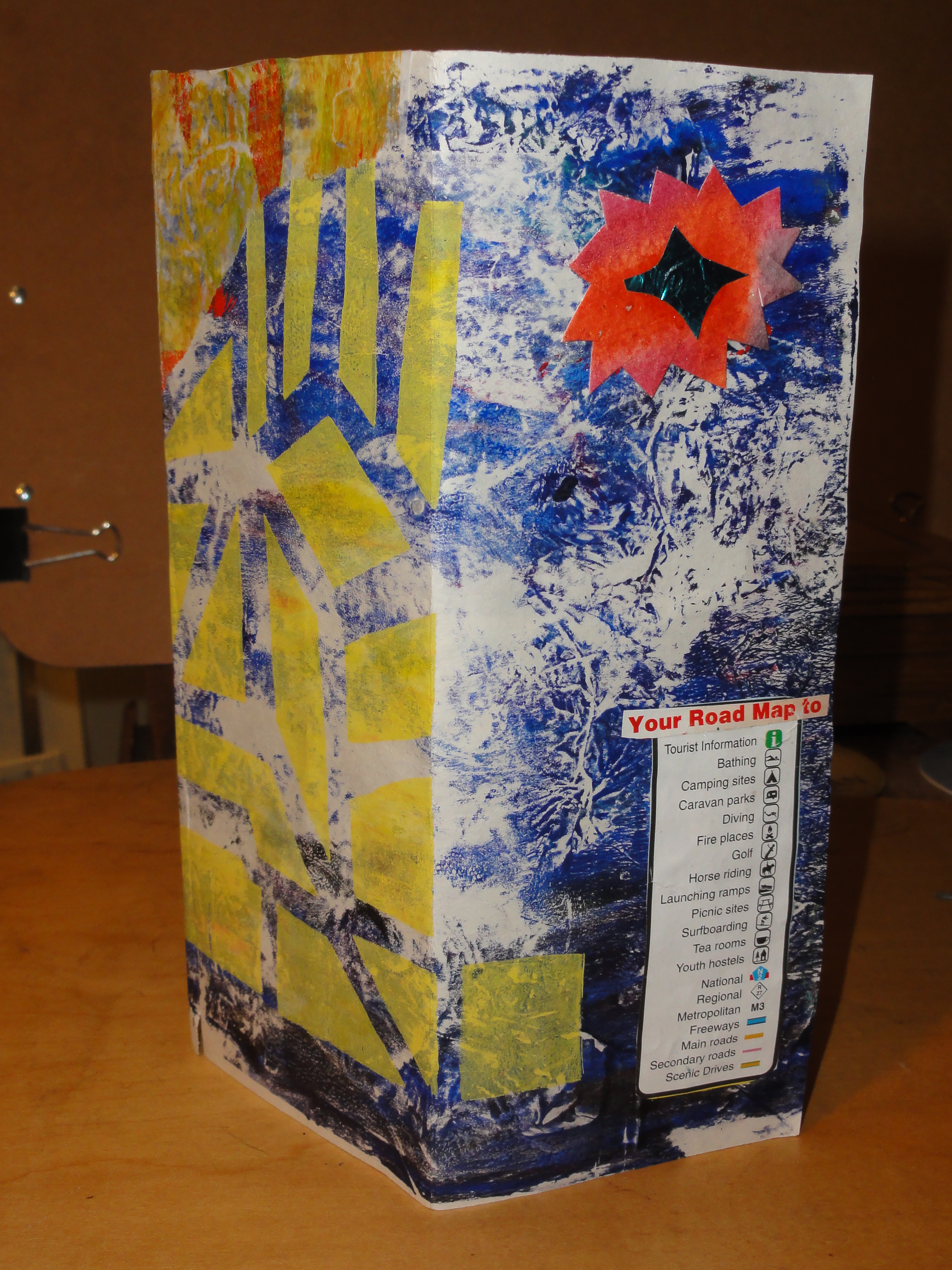
Anna Podris mail art object
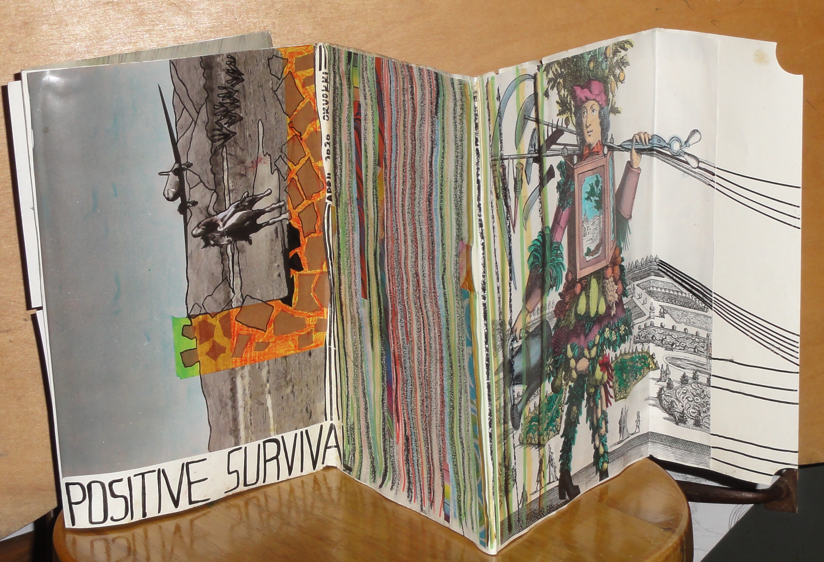
Orvokki Crosby sent a wonderful mail art folder created from what appears to be a long dust jacket with many labor intensive additions, all textured with meticulous marker highlights. She is a big fan of snail mail and, like myself and many others, hopes mail art remains viable (along with the Postal Service that allows it to exist!)
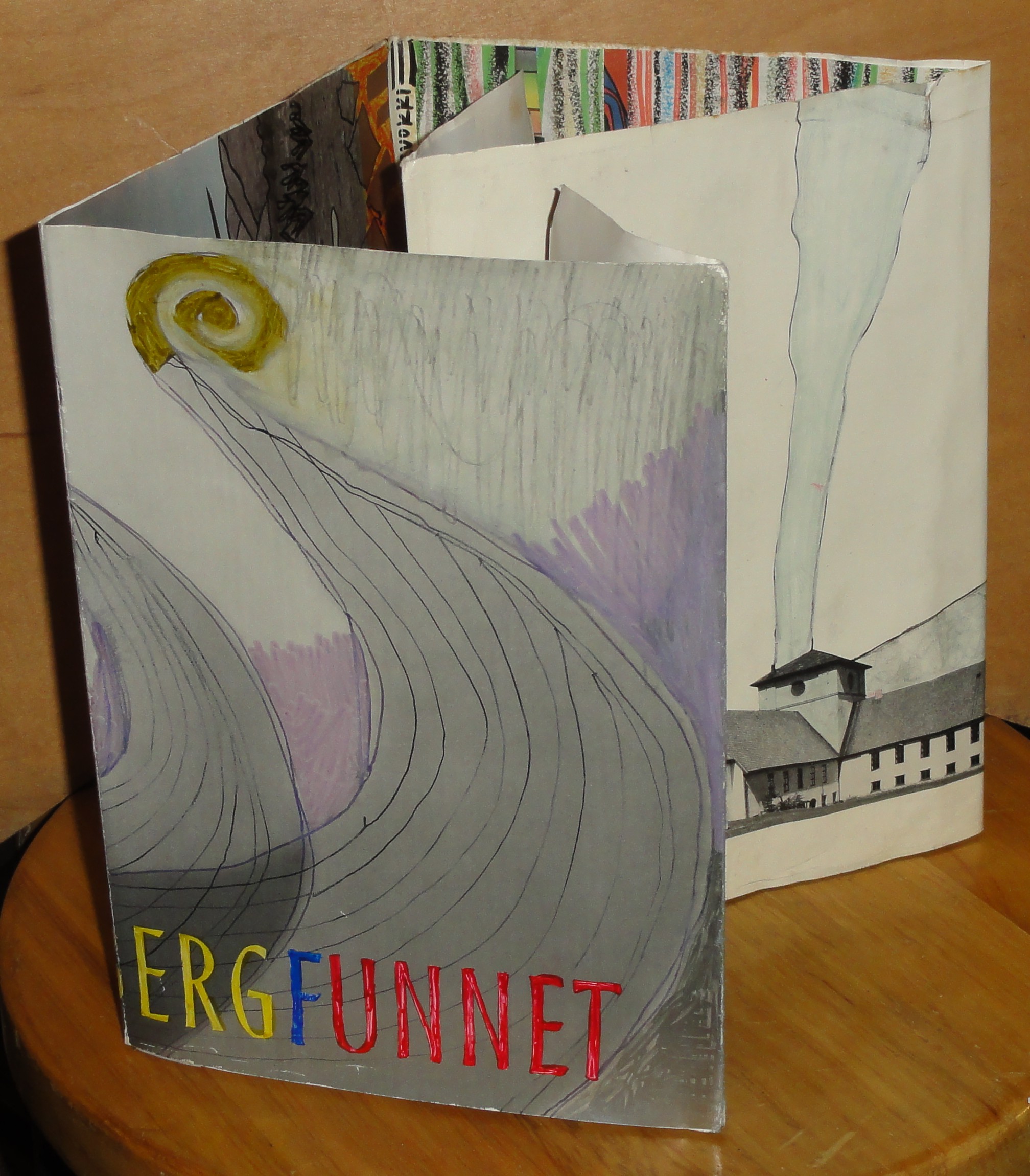
Orvokki Crosby’s mailing from front
The mail art pictured at the top of the post features several postcards from Connie Bostic, a beloved Asheville artist and pillar of the BMC scene there, as well as John Justice, a new writer friend who says he is inspired by the mail art he has received. The “Quing” postcard is from Richard C, who curated the 1976 Ray Johnson mail art exhibit that got me started with mail art in the first place. Richard is going strong with mail art, and so am I. Maybe in the slightly new world in which we find ourselves, others too will see the value in this populist and irrepressible art form.
raleighrambles.com

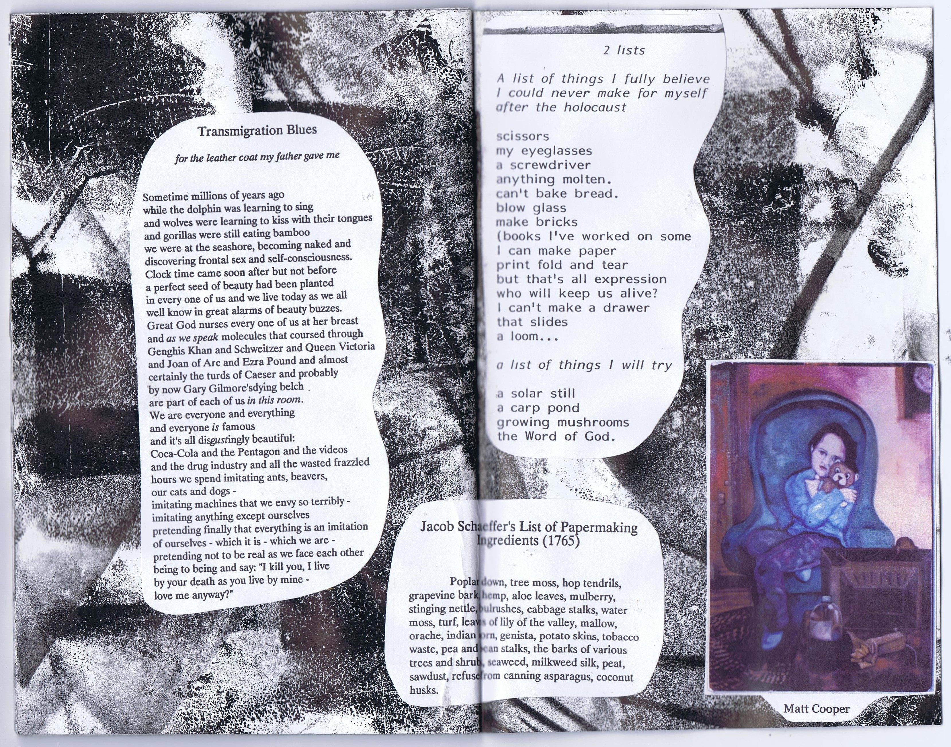
portrait by Guillermo Velasco


